Showing posts with label GeoDA. Show all posts

Sunday, February 21, 2016

Spatial Analysis with GeoDa: Part II - Importing Data and Tools

GeoDa opens as a "floating bar" which you will find nice as you do analysis and realize multiple linked windows can be arranged.  The maps and graphs are interactive, as I'll show in later posts, show selecting features in one window will highlight the same parts in other windows.

When I learn a new piece of software, I always go from left to right.  
File Menu
The "File" menu allows you to import data, save and load projects (self-named *.gda files), and export selected data. In addition, there is a nice Project Information option that tells the title, data source and type, project name, number of observations and fields.

Data Formats
Users can import a wide array of file formats: shapefile, SQLite/SpatialLite, *.csv , .xls, .dbf, .json, .gml, .kml, and MapInfo files.  Remember, are analyzing vector data, so points, lines, and polygons. Remember map projections matter, since spatial weights are created based on distance!

GeoDa does a great job of offering multiple file types to import.
Tools Menu: Spatial Weights
Spatial weights are used to model spatial relationships. Using GeoDa, we can create spatial weights based on contiguity/bordering (think chess moves: rook or queen), distance, and the number of nearest neighbors.  Imagine a grid or matrix that has a row and column for every feature.  The cells are populated using 0/1 for weights based on contiguity (where a feature borders another) or distances for distanced based weights.

Tips:
  • Generally, do not go above 2nd order of contiguity: 1st order contiguity is neighbors, 2nd order is neighbors of neighbors.  Anything beyond this becomes extremely difficult to interpret.
  • The GeoDa Center also has PySAL an open source Python library that can be used to create spatial weights and perform spatial analysis.
The first option is "Select" if you have already created weights.  The second option is "Create."  Here you will a couple of options to examiner spatial relationships in your data.  Which one you choose should be based on the phenomenon you are studying. Like other types of analysis, you will also want to examine how different spatial weights affect your results.
Connectivity Histogram
Another one of GeoDa's cool features is a histogram that shows the number of features with a specific number of features.  It can also help you clear up any questions you have about different types of contiguity and how spatial relationships are modeled.

On the histogram a right, the bar/bin for two neighbors is selected.
On the map at left the county is highlighted. Selecting other bars would highlight more features.
Users can also see the distribution of the spatial weights from the histogram.
Shape
In case you tabular data, you can create points from this menu. You can also create a bounding box or grid.  Next time, we'll look at the Table and Map toolbars.

Want blog or YouTube updates?  You can follow me @jontheepi: https://twitter.com/jontheepi

Wednesday, February 3, 2016

Spatial Analysis with GeoDa: Part I - Introduction

GeoDa (https://geodacenter.asu.edu/software) is a free and open source cross-platform program for exploratory (spatial) data analysis or EDA/ESDA and maximum likelihood spatial regression. It has been downloaded nearly 150,000 times and is available on Windows, OS X, and Linux.  ASU's GeoDa center is home to Luc Anselin, e.g. Anselin's Moran's I a local indicator of spatial autocorrelation or LISA.

Update #1: It looks like an older version of GeoDa's source code is available (circa 2014) but not more current versions: https://code.google.com/archive/p/geoda/source

Why use GeoDa?
You are interested in spatial analysis of vector data (points, lines, polygons) and statistics.  This includes looking for clusters of count or rate data, which have similar attribute values, performing regression (asking why a certain pattern exists), observed/predicted values, residuals, and diagnostics. Spatial statistics are commonly used in mainly fields including health, criminology, and pretty much everything!

If you are using GIS for a problem, at some point, you should consider spatial statistics.  The human brain and eye can only see so much.  Some patterns aren't easily apparent.

Spatial analysis can come at a cost ($), and this is why GeoDa is so great!  It is free, open source, and has great capabilities  It even includes some advanced options which you can't currently find in ArcGIS.

Features
GeoDa includes the ability to make choropleth maps, graphs, Thiessen polygons, creating spatial weights using queen and rook contiguity (which requires a high level license in ArcGIS), graphing features by number of neighbors, linked graphs you can 'brush,' LISAs, and regression. We will dive deeper into features later--there is a lot to cover.

A list of GeoDa's features can be found at: https://geodacenter.asu.edu/general-features.  Also, here is a list of its modeling features: https://geodacenter.asu.edu/node/397.

Examples of Use
In 2014, I wrote about a simple use case: examining health insurance rates at the county-level:
http://opensourcegisblog.blogspot.com/2014/04/exploring-health-insurance-estimates-by.html.

More to come...
This is the first part in a series that explores GeoDa's functions and spatial statistics. If there is something you would like to see, leave it in the comment section below.

Want blog or YouTube updates?  You can follow me @jontheepi: https://twitter.com/jontheepi

Tuesday, December 8, 2015

QGIS and FOSS GIS Wishlist for 2016

Happy holidays! I am certainly thankful for QGIS this year as it showed significant improvements to its capabilities and the user experience.  Many other free and open source GIS projects also improved including a major update of GRASS GIS and gvSIG graduating from incubation. In addition, SaTScan continues to get easier to use while providing advanced spatio-temporal statistics. GeoDA has reached nearly 150,000 downloads, and LAStools continues to rock!

Thanks to QGIS and  ALL FOSS GIS Developers!
I wanted to take a moment to talk about my QGIS wishlist for 2016.  In the coming year, I hope to get more involved...I am aiming for trying to create some plugins. You can checkout the QGIS roadmap and submit requests for new features at: http://hub.qgis.org/projects/quantum-gis/roadmap.

What are your wishes for QGIS in 2016?  Feel free to leave them in comment section below!

Of course, the core QGIS developers are always hard at work, and some of these may not be scheduled for the near or future release, but it is always good to dream! These are on the advanced feature end, and although not critical, would be nice to have.

My QGIS wishlist for 2016:
  • Continued commitment to cartography (definitely happening)
  • Full-funding goals reached for crowdsourced QGIS plugins and projects.
  • More maps in the QGIS Flickr Showcase (Do your part!)
  • Continued improvements to the Print Composer
  • Error-free or near-error free releases of QGIS. 
    • I worry as more features are added, more bugs could creep in!
  • Ability to join points to lines - visualizing data by street segments can be extremely cool!
  • More spatial analysis tools integrated directly into QGIS core
    • Might include linear directional mean, standard distance, or others...
  • Ability to create an address locator from reference data
    • Online locators have limitations (number of records that can be (batch) geocoded) and can't be used for confidential data
Some other/non-QGIS wishes
How to contribute
Lastly, there are many ways to contribute to QGIS: http://qgis.org/en/site/getinvolved/index.html. Also, if you use QGIS, whether for school, business, government, or non-profit, please consider a donation!  https://www.qgis.org/en/site/getinvolved/donations.html

Monday, March 30, 2015

FOSS GIS Version Checks - March 2015

Keeping software up-to-date is extremely important. Free and open source (FOSS) GIS software are no exception.  Typically, updates bring fixes, better stability, sometimes performance improvements or security patches, and even new features, some of which can be game changers!  Keep an eye on FOSS GIS websites or subscribe to their e-mail listserves to keep up-to-date.

Here's a quick list of a few free and open source GIS programs, related software packages and libraries, and their version numbers.

Desktop GIS
GRASS GIS 7.0.0 LTS
QGIS 2.8.1 Wien LTR
OpenJump 1.8.0

Remote Sensing/Image Processing
Orfeo Toolbox 4.4
Opticks Image Processing 4.12.0

LIDAR
Fusion LIDAR 3.42
FugroViewer 2.0
LAStools (March 2015)

Spatial Analysis
GeoDA 1.6.7
GWR 4.0
SaTScan 9.4.1

Web map development
Leaflet 0.7.3 - an open source JavaScript library for mobile web maps
Open Layers 3.4
GeoServer 2.7.0

QGIS Visual Changelog makes learning about new features a breeze!
Many open source GIS programs have a roadmap, 'wiki', or version log. These exhaustive sources of information can give you the heads-up on when an update will be released and what features the new version may contain.  They also contain lists of bugs, potential fixes, and the progress toward the fix.

Lastly, updates for paid software are also important and sometimes may require you to update your license agreement, depending on when you purchased the software. Additional fees may apply.

Sunday, February 1, 2015

Crime Analytics for Space-Time (CAST)

Crime Analytics for Space-Time (CAST) - alpha (2013) is a free and open-source cross-platform program (Windows, Mac OSX and Linux) designed "to detect spatial patterns and trends in crime data."

CAST is a nifty piece of software that combines key functions of other programs from the ASU GeoDA Center with a greater emphasis on temporal trends.  It even allows you to view data by calendar days, months, and years.

What you will need...
All you need is a shapefile of projected crime incident data and any boundary files (posts, census tracts, blocks, etc.).  To perform some types of cluster analysis, you will also need to aggregate your data.  If all you have is a *.csv, you can use QGIS to crate a shapefile file and save it for importing into CAST. There is sample data from San Francisco available here.

Check the format of your date field
If you are having trouble with using your data's date fields in CAST, use QGIS's field calculator to create a new variable with an output field type of "Date." Next, use "Conversions" and "to date" under the function list, and make sure the variable you enter is in the format "YYYY-MM-DD".  So, the expression should read:  todate( "Date Field" )
  • Make sure to create separate fields for date and time--rather than one single field. 
  • I tried a couple different formats but this format worked. 
  • In CAST, you will be able to select your date field. 
CAST can do a lot!
In the "Tools" menu, you can create a grid and save it as a shapefile.  Under "Table", you can view attribute data for your shapefile. The "Weights" menu allows you to create spatial weights and view a connectivity histogram, like in GeoDA.  The "Map" menu allows you to symbolize polygons by several different criteria.  The real fun comes in the last four menus: Calendar Map, Cluster Map, Time, and Explore.

Calendar Map + Dynamic Map
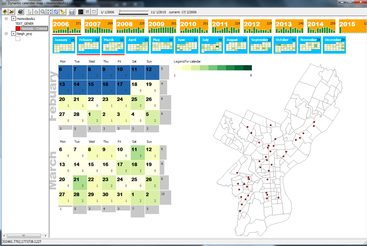
One of CAST's interesting features is combing a calendar with the number of events and a map.  You can add shapefiles and layer them, although a bit tricky by clicking on each. Below are few examples using homicide data from Open Data Philly.


A calendar and map of homicides in Philadelphia starting in 2006.
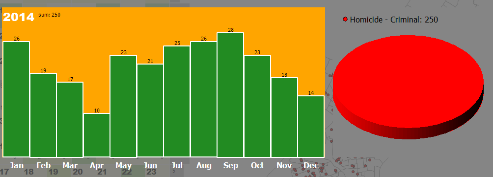
Clicking a calendar will bring up a bar and pie graph (which can show a
breakdown if there is more than one category of crime/event in your data).
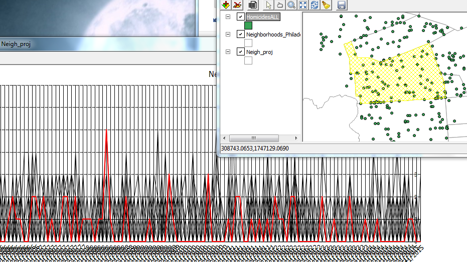
Graphs and maps are linked in CAST, so clicking on a feature or peak in a graph will highlight the selected features.
Like other ASU software, all graphs and maps are linked. Here one line was selected,
which represents one neighborhood, and the corresponding area on the map is highlighted.
Cluster Map
You will find a lot of tasks that are identical to GeoDA here plus some dynamic density maps.

Time & Explore
Trend graphs area available here as well as standard graphs like a histogram, scatterplot, and boxplots.

In sum...
Looking at patterns over space and time is difficult, but CAST can help.  Unfortunately, you cannot save a session in CAST so be sure to keep track of what steps you perform.  Limit your data to the time period of interest. I would not recommend adding huge point shapefiles.  Lastly, I was not able to save a movie/*.gif of animations over time, but if I figure it out, I will update this post.

For more information:
CAST Manual

Tuesday, April 15, 2014

Exploring Health Insurance Estimates by County Using GeoDA

Health insurance has been an important topic over the last several months, with the opening and closing of open enrollment at HealthCare.gov.  Most recently, the Census released its first estimates of health insurance coverage at the census tract level.  Typically, estimates have been made for county-level data which is what I explore here from the Small Area Health Insurance Estimates (SAHIE) Program.

I used the latest build of GeoDA 1.5/Beta/preview to explore spatial patterns in 2012 estimates for the percent of population that is uninsured under age 65 by county.  I examined a univariate Local Moran's I and a bivariate example using the percent below the poverty level.

If you have not used GeoDA before to conduct exploratory spatial data analysis (ESDA), you need to give it a try.  The latest build features more data import/export and editing options, a significant improvement over earlier versions.
Some of GeoDA's features are either a) not present in ArcGIS and its extensions or b) only found in ArcGIS Advanced, formerly ArcInfo, namely the creation of spatial weights using polygon contiguity/adjacency. (Note: You can create weights in ArcGIS, based on distance for example.)
To help keep all maps uniform, I imported the results into QGIS. Click on any image below to magnify it. You can find definitions for the terms and statistics used here.

Map of Percent Uninsured by County
Regionally, the South and West US have a smaller percent of counties with low rates of uninsured compared to the Midwest and Northeast. Or rather, they have a higher percent of counties with high rates of uninsured.
For the official map, for comparison, visit here.

LISA Map of Percent Uninsured by County
The map below shows clusters of counties with high, low, low-high, and high-low rates of uninsured.  Light grey areas were not statistically significant.  Spatial weights were created for queen contiguity, 1st order/neighbors.

Global (p=0.02) and local autocorrelation are present.  
The Moran scatter plot of percent uninsured vs.
lagged/neighboring counties has a r-squared value of 0.74 

LISA Map of Percent Uninsured and Percent Below the Poverty Line
Lastly, I examined a bivariate LISA of the percent uninsured and percent below the poverty line (all ages). For this map, I also included the outline of states.  Interestingly, there was no across-the-board global association, as one might expect.  However, state policies undoubtedly affect the percent insured.

No global autocorrelation (p=0.51) but local autocorrelation is present in parts of states or throughout most of particular states, for example the low percent uninsured (and low percent in poverty) in Massachusetts which underwent significant healthcare reform in 2006.  What do you think about some of the other states?

Affordable Care Act Implementation
Unfortunately, some of the states that could benefit the most from the Affordable Care Act (ACA) did not move to implement, as evidenced in this map from the Commonwealth Fund.

Those States sprinting ahead with implementation and those sitting it out.
Bottom line: GeoDA and QGIS are a potent combination.  GeoDA's import, export, and data editing features are much improved.   It is a vital tool for learning and conducting spatial analysis.  However, a few other components of GeoDA are worth mentioning including: making cartograms and conditional maps, connectivity histograms, and performing spatial regression.  As implementation of the ACA moves ahead, it will be interesting to see changes or lack of changes in the percent insured.

QGIS Tip:  Save the symbol styles (categorized) for the cluster types (LISA_CL variable) after you make them, since they can be saved, loaded, and used again for any map layer created in GeoDA as long as you don't change the default variable names.  This is a huge time saver.