Showing posts with label crime. Show all posts

Sunday, February 1, 2015

Crime Analytics for Space-Time (CAST)

Crime Analytics for Space-Time (CAST) - alpha (2013) is a free and open-source cross-platform program (Windows, Mac OSX and Linux) designed "to detect spatial patterns and trends in crime data."

CAST is a nifty piece of software that combines key functions of other programs from the ASU GeoDA Center with a greater emphasis on temporal trends.  It even allows you to view data by calendar days, months, and years.

What you will need...
All you need is a shapefile of projected crime incident data and any boundary files (posts, census tracts, blocks, etc.).  To perform some types of cluster analysis, you will also need to aggregate your data.  If all you have is a *.csv, you can use QGIS to crate a shapefile file and save it for importing into CAST. There is sample data from San Francisco available here.

Check the format of your date field
If you are having trouble with using your data's date fields in CAST, use QGIS's field calculator to create a new variable with an output field type of "Date." Next, use "Conversions" and "to date" under the function list, and make sure the variable you enter is in the format "YYYY-MM-DD".  So, the expression should read:  todate( "Date Field" )
  • Make sure to create separate fields for date and time--rather than one single field. 
  • I tried a couple different formats but this format worked. 
  • In CAST, you will be able to select your date field. 
CAST can do a lot!
In the "Tools" menu, you can create a grid and save it as a shapefile.  Under "Table", you can view attribute data for your shapefile. The "Weights" menu allows you to create spatial weights and view a connectivity histogram, like in GeoDA.  The "Map" menu allows you to symbolize polygons by several different criteria.  The real fun comes in the last four menus: Calendar Map, Cluster Map, Time, and Explore.

Calendar Map + Dynamic Map
One of CAST's interesting features is combing a calendar with the number of events and a map.  You can add shapefiles and layer them, although a bit tricky by clicking on each. Below are few examples using homicide data from Open Data Philly.
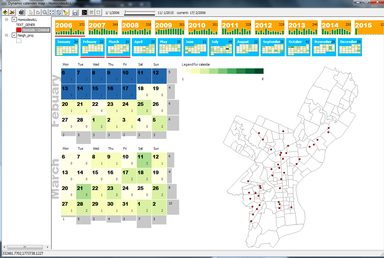

A calendar and map of homicides in Philadelphia starting in 2006.
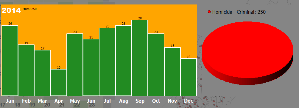
Clicking a calendar will bring up a bar and pie graph (which can show a
breakdown if there is more than one category of crime/event in your data).
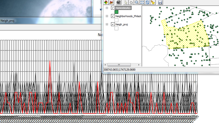
Graphs and maps are linked in CAST, so clicking on a feature or peak in a graph will highlight the selected features.
Like other ASU software, all graphs and maps are linked. Here one line was selected,
which represents one neighborhood, and the corresponding area on the map is highlighted.
Cluster Map
You will find a lot of tasks that are identical to GeoDA here plus some dynamic density maps.

Time & Explore
Trend graphs area available here as well as standard graphs like a histogram, scatterplot, and boxplots.

In sum...
Looking at patterns over space and time is difficult, but CAST can help.  Unfortunately, you cannot save a session in CAST so be sure to keep track of what steps you perform.  Limit your data to the time period of interest. I would not recommend adding huge point shapefiles.  Lastly, I was not able to save a movie/*.gif of animations over time, but if I figure it out, I will update this post.

For more information:
CAST Manual

Monday, January 19, 2015

Using R to Prepare a Case File for SatScan

SaTScan requires several different types of files for analysis: 1)  A case file with a column for the geographic unit. day, month or year (see documentation), and number of cases.  You can aggregate the data into any geographic unit--large or small. 2) A geographic coordinate file (cartesian or lat/long) with the name of the unit (i.e. census tract), x and y for centroids of the geographic units, and 3) population file with the estimated population over the time period-- by year.

In this post, I will describe creating a case file using code in R.  The goal is to create a sum of homicides by month, year (just 2013 for this example), and police beat/post.  We won't worry about any other specifics (i.e. degree) or related types of crimes, i.e. shootings.

To ready yourself for data preparation, read Richard Block's tutorial or the more extensive SatScan manual.

I use crime data from Chicago's Open Data Portal.  The same code can be applied to other types of data, health data, etc.  A few key points: 1) the data contains victim-based data--which we want to convert into incidents. 2) not every post has a homicide, and 3) the reference post list contains 275 post.  So, we will end up with a data set with 3300 rows (275 x 12 months) or simply a row for each post-month.

If you want to skip ahead and just look at the code, go to: http://goo.gl/pmOi1u.


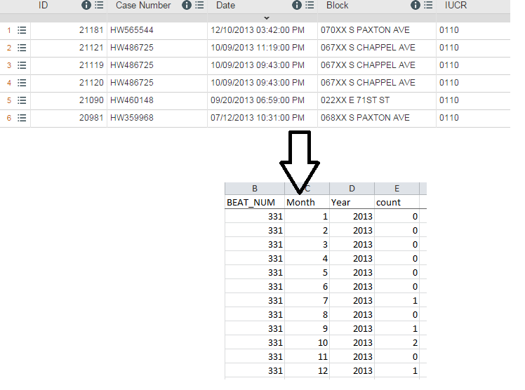
At the top: What you start with.  Bottom: After processing in R

Overview of Steps: See the code for further details

Step #1: Two files are imported: 1) a victim-based file of all crimes, which is narrowed down to just homicides (you could also add in shootings) and 2) a 'reference' file or simply a list of the police beats/posts in Chicago.

Step #2:  The data are summed up so that each row contains the total number of victims, then grouped again into incidents by using two different count variables.

Step #3: The list of police beats get column variables for each month in the year and expanded by reshaping data from wide to long.  This serves as a 'reference list' for matching purposes.

Step #4:  The two data sets are matched the 'unmatched' records are also kept.  These are post-months that don't have a homicide, so each count value is replaced with a zero.

Step #5: To ensure the code has worked, I check the total number of rows (3300) and spot check various posts to make sure the data has been grouped in to incidents and posts correctly.  

Whether in R or using for-fee software (i.e. SAS, STATA), preparing data for SaTScan is relatively straightforward but there are a number of steps.

Update #1 (2/18/15)
Scan statistics can also be implemented in R's Spatial Epi Package and rsatscan .

Thursday, August 28, 2014

An Introduction to Leaflet, Part I: CSVs and Pop-ups

Leaflet is an open source JavaScript library for publishing interactive web-based and mobile maps. Most tutorials on Leaflet's website are geared towards creating basic maps with a small number of features.

Despite this, the code libraries are capable of doing much more!  Today's post will focus on importing and using point data in spreadsheet form, specifically comma separated value files or *.csv.  (In the next post, we will look at other data types and formats.)  l will use the Leaflet Simple CSV Plugin that contains many different features, which I will describe later.

The data
The data set contains locations of homicides (417) in Chicago during 2013.  It also contains attribute data for incident, type, circumstances, arrests, date, and, location.  It is available through Chicago's large open data portal.

End product:
If you want to skip to see the end result, click this link: http://webmapexamples.net/leaflet-simple-csv-master/index.html.  The screenshot below shows the map on an iPad Mini (Gen 1). Click for a closer vew.

On iPad Mini: A Leaflet Map of Homicides in Chicago, 2013
How I got there...
There are several Leaflet plugins to import *.csv files.  On the web, I found the Leaflet Simple CSV Plugin by Matthew Perry that incorporates several different plugins, including a bonus one for clustering/collecting markers, into one set of code. Furthermore, it contains code for allowing attribute data from the *.csv file to be displayed when a marker is clicked.  

Pop-up displaying attribute data from the *.csv about the homicide
The code package put together many different capabilities. It was easy-to-use, modify, has documentation, and a working example.  I accessed the maps on several devices: two different computers, the iPad mini, an iPhone 4S, and a Nexus 7 tablet.  The only device that had an issue was the iPhone 4S.  When clicking a point market, pop-up attribute data was not always displayed and simply flickered.  I am still looking into this and will post anything I found out.

Resources for Learning Leaflet
Leaflet.js Essentials (Published August 2014)

Where to learn JavaScript and more coding skills for free
Codecademy

Monday, April 7, 2014

More 3D Maps and Tips Using QGIS2threejs

After last week's popular post, here are few more maps and tips using the QGIS2threejs plugin.

The Maps
  1. 3D Chloropleth Map of Crime Counts by Police Beats in Chicago, 2013
  2. Visualization of Mt. Rainier, Seattle
  3. Groundwater Depths in Three Counties in Nevada
Data sources and references:
Open Data Chicago
Chicago: Official Police Maps (CLEARMAP)
National Map Viewer
Nevada Bureau of Mines and Geology

When viewing the maps, if a black box appears instead of a basemap, try refreshing/reloading your browser and the basemap should display properly.

The Tips

3D Chloropleth Map:  Here is a trick to create a 3D chloropleth map on a flat surface.  The plugin won't run without a digital elevation model (or DEM) raster, but you can 'trick' it into using a flat raster.
  • Updated(12/9/2015): The plugin now allows users to select a flat surface/no DEM used
  • Take the raster calculator and exponentiate/raise all cell values to the power of 0 (rastervariable^0). The resulting raster will be flat with a value of 1.  Alternatively, multiply by zero.  (You may also have to symbolize null values as well.)
  • Classify and symbolize the polygons using your desired color scheme--before using the plugin
  • In addition, I changed the color of the raster file in QGIS to match the background in the *.html file (#ccccff). 
  • I added HTML code for a basic legend using frames (90% for the map, 10% for the legend)
Basic HTML code sourcing the two frames.  The "Chicago" frame was generated from QGIS.
The "Legend" frame was a simple piece of code directed to a JPG of the Legend.
Screenshot of the final map and legend.
Mt Rainier:  Instead of using a web service, I download imagery and used the Build Virtual Raster in QGIS.   I used a detailed DEM and imagery from the USGS's National Map Viewer.  You can download files from USGS by using a bounding box, for example.  I used a vertical exaggeration of 1.1 in the plugin.  Click the screenshot below to enlarge a comparison of between Google Earth and the plugin's version of Mt. Rainier.
Left: Google Earth, Right: Plugin result using files from USGS

3D Groundwater Depths / Underground:  Using point data with depths, you can either select a negative multiplier in the plugin or create a new variable and multiply your depths by -1.

If your depths are positive values, select a negative multiplier in the plugin.
An overhead and underground view of the map.
The orange boundary represents three counties of interest.