- Eight-related deaths so far. I hope not to have to update this.
- Healthcare workers will make up a disproportionate percent of cases and possibly also fatalities.
- The app was created using R, rshiny(package), and shinyapps.io for hosting
- Map will be updated daily.
- China only reported 5 deaths in healthcare workers. Healthcare personnel made up 4% of cases. Fifteen percent of healthcare workers that got ill were classified as severe cases. (https://jamanetwork.com/journals/jama/fullarticle/2762130)
A blog devoted to Open Source GIS, Data, Analysis, Web Publishing, and Image Processing...
Saturday, March 28, 2020
Healthcare worker deaths in the US from novel Coronavirus (COVID-19)
Created a quick app based on news reports: https://jontheepi.shinyapps.io/hcwcoronavirus/.
Thursday, April 14, 2016
The Last Post...
After some soul searching, I've decided to stop writing regular blog posts. It has been my pleasure to help out people interested in doing spatial things...and for free! The GIS world is large, diverse, friendly, and super smart! I've enjoyed getting to know what other people are working on around the world and how to approach very complex problems! I've learned a lot in the process, and I hope you have too!
Why stop? Well, projects were getting more complex and time consuming, including a post on GeoServer, which didn't get finished, and more maps using Leaflet. Believe it or not, I have more than 100 ideas for posts--which never got done! I also spent extra time creating a few YouTube videos. -The process is just too time consuming, I plan to devote more time to trying to develop a QGIS plugin and hiking in the Mid-Atlantic region. My only regret is that I didn't finish the GeoDA tutorial. That was never my intention. My favorite thing has been to watch QGIS grew into the platform it is today!
Lastly, I've decided to re-double my efforts at work in violence prevention and reducing firearm homicides in Baltimore City (http://data.baltimoresun.com/news/police/homicides/). If you are still interested in following me, subscribe to my Twitter feed @jontheepi: https://twitter.com/jontheepi.
Why stop? Well, projects were getting more complex and time consuming, including a post on GeoServer, which didn't get finished, and more maps using Leaflet. Believe it or not, I have more than 100 ideas for posts--which never got done! I also spent extra time creating a few YouTube videos. -The process is just too time consuming, I plan to devote more time to trying to develop a QGIS plugin and hiking in the Mid-Atlantic region. My only regret is that I didn't finish the GeoDA tutorial. That was never my intention. My favorite thing has been to watch QGIS grew into the platform it is today!
Lastly, I've decided to re-double my efforts at work in violence prevention and reducing firearm homicides in Baltimore City (http://data.baltimoresun.com/news/police/homicides/). If you are still interested in following me, subscribe to my Twitter feed @jontheepi: https://twitter.com/jontheepi.
All the best!
Sunday, February 21, 2016
Spatial Analysis with GeoDa: Part II - Importing Data and Tools
GeoDa opens as a "floating bar" which you will find nice as you do analysis and realize multiple linked windows can be arranged. The maps and graphs are interactive, as I'll show in later posts, show selecting features in one window will highlight the same parts in other windows.

File Menu
The "File" menu allows you to import data, save and load projects (self-named *.gda files), and export selected data. In addition, there is a nice Project Information option that tells the title, data source and type, project name, number of observations and fields.
Data Formats
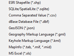
Users can import a wide array of file formats: shapefile, SQLite/SpatialLite, *.csv , .xls, .dbf, .json, .gml, .kml, and MapInfo files. Remember, are analyzing vector data, so points, lines, and polygons. Remember map projections matter, since spatial weights are created based on distance!
Tools Menu: Spatial Weights
Spatial weights are used to model spatial relationships. Using GeoDa, we can create spatial weights based on contiguity/bordering (think chess moves: rook or queen), distance, and the number of nearest neighbors. Imagine a grid or matrix that has a row and column for every feature. The cells are populated using 0/1 for weights based on contiguity (where a feature borders another) or distances for distanced based weights.
Tips:
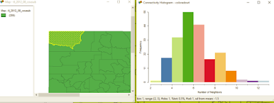
Another one of GeoDa's cool features is a histogram that shows the number of features with a specific number of features. It can also help you clear up any questions you have about different types of contiguity and how spatial relationships are modeled.
In case you tabular data, you can create points from this menu. You can also create a bounding box or grid. Next time, we'll look at the Table and Map toolbars.
Want blog or YouTube updates? You can follow me @jontheepi: https://twitter.com/jontheepi
| When I learn a new piece of software, I always go from left to right. |
The "File" menu allows you to import data, save and load projects (self-named *.gda files), and export selected data. In addition, there is a nice Project Information option that tells the title, data source and type, project name, number of observations and fields.
Data Formats
Users can import a wide array of file formats: shapefile, SQLite/SpatialLite, *.csv , .xls, .dbf, .json, .gml, .kml, and MapInfo files. Remember, are analyzing vector data, so points, lines, and polygons. Remember map projections matter, since spatial weights are created based on distance!
![]() |
| GeoDa does a great job of offering multiple file types to import. |
Spatial weights are used to model spatial relationships. Using GeoDa, we can create spatial weights based on contiguity/bordering (think chess moves: rook or queen), distance, and the number of nearest neighbors. Imagine a grid or matrix that has a row and column for every feature. The cells are populated using 0/1 for weights based on contiguity (where a feature borders another) or distances for distanced based weights.
Tips:
- Generally, do not go above 2nd order of contiguity: 1st order contiguity is neighbors, 2nd order is neighbors of neighbors. Anything beyond this becomes extremely difficult to interpret.
- The GeoDa Center also has PySAL an open source Python library that can be used to create spatial weights and perform spatial analysis.
- More about contiguity based spatial weights: https://geodacenter.asu.edu/node/380 and distance-based weights: https://geodacenter.asu.edu/node/384
Another one of GeoDa's cool features is a histogram that shows the number of features with a specific number of features. It can also help you clear up any questions you have about different types of contiguity and how spatial relationships are modeled.
In case you tabular data, you can create points from this menu. You can also create a bounding box or grid. Next time, we'll look at the Table and Map toolbars.
Want blog or YouTube updates? You can follow me @jontheepi: https://twitter.com/jontheepi
Labels:
ASU,
contiguity,
GeoDA,
GeoJSON,
kml,
PySAL,
Python,
shapefile,
spatial analysis,
spatial weights
Wednesday, February 3, 2016
Spatial Analysis with GeoDa: Part I - Introduction
GeoDa (https://geodacenter.asu.edu/software) is a free and open source cross-platform program for exploratory (spatial) data analysis or EDA/ESDA and maximum likelihood spatial regression. It has been downloaded nearly 150,000 times and is available on Windows, OS X, and Linux. ASU's GeoDa center is home to Luc Anselin, e.g. Anselin's Moran's I a local indicator of spatial autocorrelation or LISA.Update #1: It looks like an older version of GeoDa's source code is available (circa 2014) but not more current versions: https://code.google.com/archive/p/geoda/source
Why use GeoDa?
You are interested in spatial analysis of vector data (points, lines, polygons) and statistics. This includes looking for clusters of count or rate data, which have similar attribute values, performing regression (asking why a certain pattern exists), observed/predicted values, residuals, and diagnostics. Spatial statistics are commonly used in mainly fields including health, criminology, and pretty much everything!
If you are using GIS for a problem, at some point, you should consider spatial statistics. The human brain and eye can only see so much. Some patterns aren't easily apparent.
Spatial analysis can come at a cost ($), and this is why GeoDa is so great! It is free, open source, and has great capabilities It even includes some advanced options which you can't currently find in ArcGIS.
Features
GeoDa includes the ability to make choropleth maps, graphs, Thiessen polygons, creating spatial weights using queen and rook contiguity (which requires a high level license in ArcGIS), graphing features by number of neighbors, linked graphs you can 'brush,' LISAs, and regression. We will dive deeper into features later--there is a lot to cover.
A list of GeoDa's features can be found at: https://geodacenter.asu.edu/general-features. Also, here is a list of its modeling features: https://geodacenter.asu.edu/node/397.
Examples of Use
In 2014, I wrote about a simple use case: examining health insurance rates at the county-level:
http://opensourcegisblog.blogspot.com/2014/04/exploring-health-insurance-estimates-by.html.
More to come...
This is the first part in a series that explores GeoDa's functions and spatial statistics. If there is something you would like to see, leave it in the comment section below.Want blog or YouTube updates? You can follow me @jontheepi: https://twitter.com/jontheepi
Thursday, January 21, 2016
Looking at Weather Maps and Data for Winter Storm Jonas
Previously, I've written about Being Weather Ready: The Open Source Way and Weather GIS, Data, and Viewers. I would probably stop blogging about the weather if there weren't bigger storms each year. Family, friends, and coworkers often ask me what the weather will be like or get confused about updated/changing predictions. Maybe yours do to!
Local Forecast Office
The National Weather Service (NWS) has local forecast offices spread throughout the country. Often, the offices have specific pages to deal with certain weather threats.
For example, the Sterling Office for DC-Virginia-Maryland has a Winter Weather Page: http://www.weather.gov/lwx/winter. The maps below show the:
NWS also has a GIS Data Portal (http://www.nws.noaa.gov/gis/) so you can make your own maps. But you don't have to go through all those steps and can use web-based map tools like NOWCOAST (http://nowcoast.noaa.gov/) for real-time information and the easier to use Enhanced Data Display (http://preview.weather.gov/edd/). There is also a briefing site: http://www.weather.gov/briefing/
Storm Results
See below from the NWS, or check out the NY Times map "How much snow has fallen?": http://www.nytimes.com/interactive/2016/01/22/us/east-coast-snow-storm.html?_r=0
Satellite Imagery
Map Examples
Some maps convey their message better than others. Weather maps are no exception...What do you think about the maps below? You be the judge...
Easiest on the Eyes
USA Today had the most pleasing storm map that I could find. Simple and effective.
Hard on the Eyes
The Weather Channel loves translucent boxes, apparently. This map of regional temperatures and precipitation probably combines too much information on one map.
The second places cities and accumulation totals in boxes which makes it harder to read. The boxes for cities probably is not necessary.
Too Slow...but...
Lastly, it is notable to add that ESRI deploys personnel for large disasters, and usually posts a quick map. Although in this case, their snow map animation is nothing to get excited about: http://www.esri.com/services/disaster-response/severe-weather/us-snowfall-forecast.
NOAA has recently quadrupled their computing power which will lead to better forecasts for everything from winter storms to major hurricanes.Fortunately, there is a lot of great information, maps, and data out there, if you know where to look! Winter storms don't carry official names. But,the Weather Channel has adopted this idea and named the upcoming storm "Jonas."
Local Forecast Office
The National Weather Service (NWS) has local forecast offices spread throughout the country. Often, the offices have specific pages to deal with certain weather threats.
For example, the Sterling Office for DC-Virginia-Maryland has a Winter Weather Page: http://www.weather.gov/lwx/winter. The maps below show the:
- At the top, links and headlines highlight key weather threats and message
- Minimum, most likely, and maximum amount of snowfall
- Storm track, time of onset, and reported snowfalls are all clearly labeled.
- Warning areas are highlighted at a county level. Clicking the map takes you to the local forecast in text--with additional links to hourly graphs.
- Probabilities are given for different snowfall amounts
- Weather fronts are highlighted nationally
- Lastly, always check the time stamp of the forecast map, since forecasts change frequently.
| Some weather information can't be captured well on maps, so you will also have to look at graphs. |
NWS also has a GIS Data Portal (http://www.nws.noaa.gov/gis/) so you can make your own maps. But you don't have to go through all those steps and can use web-based map tools like NOWCOAST (http://nowcoast.noaa.gov/) for real-time information and the easier to use Enhanced Data Display (http://preview.weather.gov/edd/). There is also a briefing site: http://www.weather.gov/briefing/
Storm Results
See below from the NWS, or check out the NY Times map "How much snow has fallen?": http://www.nytimes.com/interactive/2016/01/22/us/east-coast-snow-storm.html?_r=0
| Jonas shaped up to be everything the predictions were! |
Satellite Imagery
![]() |
| A Snow Blanket for the East Coast. NASA Earth Observatory images (first, second) by Joshua Stevens, using Landsat data from the U.S. Geological Survey. NASA image (third) by Jeff Schmaltz, LANCE/EOSDIS Rapid Response. Caption by Mike Carlowicz. |
Some maps convey their message better than others. Weather maps are no exception...What do you think about the maps below? You be the judge...
Easiest on the Eyes
USA Today had the most pleasing storm map that I could find. Simple and effective.
- At this scale, the classification and increment of snowfall is appropriate. Although not described in the text, the mapmaker assumes the reader will see that Washington and Charleston, highlighted differently in white, will receive the most snowfall.
| Source: USA Today |
The Weather Channel loves translucent boxes, apparently. This map of regional temperatures and precipitation probably combines too much information on one map.
- Precipitation type is also classified into different colors and different icons (snowflakes and rain drops).
The second places cities and accumulation totals in boxes which makes it harder to read. The boxes for cities probably is not necessary.
| Source: Weather Channel via AccuWeather |
Too Slow...but...
Lastly, it is notable to add that ESRI deploys personnel for large disasters, and usually posts a quick map. Although in this case, their snow map animation is nothing to get excited about: http://www.esri.com/services/disaster-response/severe-weather/us-snowfall-forecast.
- However, one nice feature, which I wish I saw more of in other interactive maps, are spatial bookmarks that allow the viewer to jump to certain places in the map.
| Slow animation but spatial bookmarks (drop-down at the top) are a nice touch and speed navigation. |
Monday, January 4, 2016
Video: Open GIS Data Portals
Open GIS data portals are becoming more common, and can contain lots of geospatial data, but is it a case of too much of a good thing?
What is a Portal?
An internet site providing access or links to other sites. In the case of open GIS data, the file may appear on the same page, link out to another website (or portal) or require more digging. In addition, some GIS portals have links to web map services.
Search is the thing...
Open data portals house more and more data and therefore can become more difficult to search over time. Creating complex searches is sometimes not available and can slow the discovery process.
What are they made of?
Open data portals leverage free and open, propriety, or hybrid data and/or GIS platforms.
Here one minute, gone the next...
While often data can be downloaded directly, some sites link to external or partner data sources. Some data may seem accessible and near-at-hand but actually require more searching and digging.
Syndication
In some cases, this is the result of syndicated data sets. For example, on federal data portals, local and state governments can have their data sets metadata appear in search results and link out to the resource. In others, this can be overused, frustrating, or lead to broken links or missing resources. Sometimes going directly to the source can be easier than navigating a much larger data portal.
Examples
We will look at several open data portals for geospatial data:
What is a Portal?
An internet site providing access or links to other sites. In the case of open GIS data, the file may appear on the same page, link out to another website (or portal) or require more digging. In addition, some GIS portals have links to web map services.
Search is the thing...
Open data portals house more and more data and therefore can become more difficult to search over time. Creating complex searches is sometimes not available and can slow the discovery process.
What are they made of?
Open data portals leverage free and open, propriety, or hybrid data and/or GIS platforms.
Here one minute, gone the next...
While often data can be downloaded directly, some sites link to external or partner data sources. Some data may seem accessible and near-at-hand but actually require more searching and digging.
Syndication
In some cases, this is the result of syndicated data sets. For example, on federal data portals, local and state governments can have their data sets metadata appear in search results and link out to the resource. In others, this can be overused, frustrating, or lead to broken links or missing resources. Sometimes going directly to the source can be easier than navigating a much larger data portal.
Examples
We will look at several open data portals for geospatial data:
Also check out http://dataportals.org/ for a neat interactive map of open data portals worldwide.
| Looking for an open data portal? Check out the interactive and searchable map on dataportals.org |
Tuesday, December 8, 2015
QGIS and FOSS GIS Wishlist for 2016
Happy holidays! I am certainly thankful for QGIS this year as it showed significant improvements to its capabilities and the user experience. Many other free and open source GIS projects also improved including a major update of GRASS GIS and gvSIG graduating from incubation. In addition, SaTScan continues to get easier to use while providing advanced spatio-temporal statistics. GeoDA has reached nearly 150,000 downloads, and LAStools continues to rock!
I wanted to take a moment to talk about my QGIS wishlist for 2016. In the coming year, I hope to get more involved...I am aiming for trying to create some plugins. You can checkout the QGIS roadmap and submit requests for new features at: http://hub.qgis.org/projects/quantum-gis/roadmap.
Of course, the core QGIS developers are always hard at work, and some of these may not be scheduled for the near or future release, but it is always good to dream! These are on the advanced feature end, and although not critical, would be nice to have.
![]() |
| Thanks to QGIS and ALL FOSS GIS Developers! |
What are your wishes for QGIS in 2016? Feel free to leave them in comment section below!
My QGIS wishlist for 2016:
- Continued commitment to cartography (definitely happening)
- Full-funding goals reached for crowdsourced QGIS plugins and projects.
- More maps in the QGIS Flickr Showcase (Do your part!)
- Continued improvements to the Print Composer
- Error-free or near-error free releases of QGIS.
- I worry as more features are added, more bugs could creep in!
- Ability to join points to lines - visualizing data by street segments can be extremely cool!
- More spatial analysis tools integrated directly into QGIS core
- Might include linear directional mean, standard distance, or others...
- Ability to create an address locator from reference data
- Online locators have limitations (number of records that can be (batch) geocoded) and can't be used for confidential data
Some other/non-QGIS wishes
- Open routing and isochrone maps for the US (See also: http://openrouteservice.org/)
- Some new and exciting projects! Revival of old favorites?
How to contribute
Lastly, there are many ways to contribute to QGIS: http://qgis.org/en/site/getinvolved/index.html. Also, if you use QGIS, whether for school, business, government, or non-profit, please consider a donation! https://www.qgis.org/en/site/getinvolved/donations.html
Subscribe to:
Posts (Atom)


