Showing posts with label ArcGIS. Show all posts

Saturday, August 1, 2015

Tutorial: Side-by-Side Maps in QGIS Print Composer

Step #1: Open New Print Composer
QGIS print composer can be a bit daunting and confusing. It is equivalent to the Layout View in ArcGIS, where users can setup their map for printing and publication. One common task is to create side-by-side maps, to compare imagery, choropleth, or other types of maps.  I looked but could not find a good tutorial with screenshots, so here we go!


Purpose
To create three side-by-side maps of different band combinations from Landsat 7 imagery of the Salton Sea. The maps will be exactly the same size.  The different band combinations were created using the Orfeo Toolbox->Image Manipulation->Images Concatenation and selecting various band combinations.

Step #1:  For starters...
I've started by just selecting the natural color view (bands 3-2-1).  Go to the the Project Toolbar in the upper left-> New Print Composer. 

  • You can also can the page layout to landscape or portrait, depending on whether your map series will be laid out horizontally or vertically.

Step #2:  Creating the first map

Click the "Add New Map" button, highlighted in red. and draw an area for your map on the blank page.  For best fit of your image, be sure in QGIS to have zoomed into an area of interest. 


  • Then on the right hand side of print composer, select "Item Properties" and click the long button for "Set to Map Canvas."
After Steps #1-2

Step #3: Add the second map

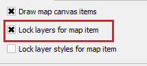
Before adding the second map to the right, scroll up in "Item properties" and check the box for "Lock layers for map item."  The click on the existing map in print composer and copy and paste it. On this second map, be sure to uncheck the box we just checked: Uncheck "Lock layers for map item."


  • In QGIS, add the next layer, in this case I added a false color image from bands 4-3-2.
  • Go back into Print Composer and hit the blue refresh button.
  • The second map should display the false color image and the first map should remain natural color.
After Step #3

Step #4: Repeat for the third map
Before copying and pasting, make sure to check the "Lock layers for map item" box.  Copy, paste, and then uncheck this for the third map, with the last set of band combinations (7-4-2).  The final map appears below.
Click to enlarge the map.
Three side-by-side maps, equal sized, and the same scale.
For more information:
You can find additional tips about using the map composer from multiple frames and different layers in this discussion on StackExchange: http://gis.stackexchange.com/questions/45174/how-to-handle-multiple-map-frames-with-different-layers-in-one-print-layout

Tuesday, June 16, 2015

QGIS vs. ArcGIS: Adding Magnetic Declination

This is a QGIS vs. ArcGIS throwdown.  It has been a while since I did the last one on kernel density and Thiessen polygons.  Recently, I was looking over new QGIS plugins and one in particular caught my eye: the QGIS Magnetic Declination Plugin. Magnetic declination is simply the difference between geographic and magnetic north, caused by the earth's magnetic fields. This difference also changes over time. ESRI has a nice technical article on their blog.

NOAA Historical Magnetic Declination Viewer:
http://maps.ngdc.noaa.gov/viewers/historical_declination/
ArcGIS
Adding a declination diagram in ArcGIS can be a bit tricky. As of version 10.2, there is a template and several tools to assist.  You will need a Standard or Advanced license plus the Production Mapping Extension.

QGIS Plugin
On main toolbar in QGIS, go to Plugins-->Manage and Install Plugins--> and search for Magnetic Declination. After a quick installation, you will see a green and yellow star appear on your toolbar. Click it and you will see the toolbar open below.

You can select a location off a map, such as OpenStreetMap, calculate it and map it!  Best of all, the resulting compass rose and measurements also appear in QGIS Print Composer.  Under the options tab, you can also change the color. I found it helpful to change it to black.

Steps:
  1. Click LON/LAT from map
  2. Choose any options
  3. Press "Calculate" button
  4. Then "Draw Compass Rose"
Screenshot of the plugin, steps, and buttons.

  • Click any of the screenshots below to get a closer look.
Up close example with  declination, true, and magnetic north shown in Greenland
where declination is much greater.
Showing positive, zero, and negative declination in the US.

The plugin is very new but is being updated, so stay tuned!

Update #1
I forgot to mention that you can customize the size/diameter of the compass rose--as large or as small as you need depending on whether you are interested adding it to a small scale map or a large scale map.

Sunday, March 8, 2015

Spatial Analysis with QGIS - Part I: Point Data

QGIS 2.8 Wien was released, so it is a good time to review QGIS's basic spatial analysis capabilities for vector data--starting with point data. We will also take a look at a few plugins and the SAGA and R processing toolboxes. Most of the functionality in QGIS is from Ftools, formerly a plugin, now part of base QGIS. There is also the MMQGIS plugin to examine vector data.

In addition, I will make a few recommendations for added features, or point you to another free or open source program that can be used in conjunction with QGIS or simply by importing and exporting data.

Nearest Neighbor Index
QGIS can calculate the nearest neighbor index to assess point clustering.  No p-value is given but the simple trick is to remember that large negative z-scores mean the points are clustered while large positive z-scores mean the data is more dispersed.
No p-values are given but remembering critical values/decision points,i.e. +/-1.65, 1.96,
is the easiest way to know if clustering is statistically significant.
Mean Center and Standard Distance
The mean center, an average of x- and y- coordinates, is an easy way to find the central feature and to examine spatial-temporal trends.  In the case below, the mean of all starting points, by year, for US tornadoes, 2000-2013. The data are grouped by UID, in this case a year variable.  It would be great to also be able to calculate a median center.  Data source: NOAA Storm Prediction Center.
  • In some years, the average was pulled slightly west or east.  Interestingly, the mean is pulled east in 2011, when there was a large 'outbreak' of tornadoes across the southeastern US.

The mean of all 'starting' points for US tornadoes, by year, 2000-2013.
Moreover, there are several point pattern analysis tools, including the standard distance--a measure of dispersion--in the SAGA Processing Toolbox.  More specifically the "Geostatistics" tool, contains a lot of useful functions that can be used.  The output can be  saved and displayed in QGIS.  The NOAA dataset already contains the length from start to end, but you could also calculate this by creating a distance matrix in QGIS.


The SAGA Geostatistics Toolbox in QGIS
Ripley's K
Ripley's K helps to determine clustering at different distances.  It can be implemented through the R processing toolbox in QGIS, using R's SpatStat package, or CrimeStat.

Heatmap
You can download the Heatmap plugin or use a built-in live/dynamic heat map when you go to style a layer.  For the latter, make sure to move the rendering slider to 'best' for a nice looking heatmap. Here is an example using the dynamic heat map to look at homicides in Philadelphia. Data source: OpenDataPhilly.   In future posts, we will also look at alternatives to heatmaps, like gridding/quadrat analysis.

QGIS has lot of neat options for styling vector data, including a dynamic heatmap
that changes as you zoom in and out.
 (Note: In ArcGIS kernel density tool (not to be confused with point density) remains separate from the base software and has to be purchased through the Spatial Analyst Extension).

Grouping Analysis
Lastly, grouping analysis can be examined using PostGIS, which allows for a wide variety of spatial queries using SQL, or CrimeStat.

Near future...
We will look at spatial analysis of line and polygon data as well joining points for analysis.

GME and ArcGIS
When using ArcGIS, be sure to check out the free windows-based program Geospatial Modelling Environment, or GME formerly 'Hawth's Tools," http://www.spatialecology.com/gme/.  GME has a long list of helpeful commands: http://www.spatialecology.com/gme/gmecommands.htm.

Wednesday, February 25, 2015

ESRI's Open Data vs.Data.gov

ESRI recently announced its open data website (http://opendata.arcgis.com/), which was in beta in mid-2014, so I decided it was a good time to take a look.  More and more open data is being published in a variety of places, by different organizations.

I thought it was only fair to make some comparisons. Because ESRI's user base and audiences are large, I decided the best comparison is Data.gov.  The only drawback is that Data.gov has been in existence longer.

Of course, open data is important regardless of the platform.  Moreover, open data can be imported into any free and open source GIS.
"[Open data's] impacts include... cost savings, efficiency, fuel for business, improved civic services, informed policy, performance planning, research and scientific discoveries, transparency and accountability, and increased public participation in the democratic dialogue." - Data.gov
One big difference between the sites is ESRI's contains lots of data from States vs. federal (state, and local) data found in Data.gov.  ESRI touts that it works with more than 380,000 organizations across the globe, so more open data is on its way!

A table comparing ESRI's Open Data vs. Data.gov
One big advantage of ESRI's Open Data page is being able to view geographic data in your browser immediately and even see some attribute data.

Data.gov's metrics pages are really neat including one on data sets published by agency by month: . Most data sets come from NOAA and USGS, which can be accessed in several different ways.   Obviously, a lot of the pages linked from Data.gov either use ESRI formats or are driven by ESRI products.  For developers it is also important to note that Data.gov has challenges/competitions. So be sure to check their website and social media! 

Data.gov helps you get started with browsing categories.
Currently, Data.gov has more data sets but it will be interesting to see how much ESRI can catch-up in the months to come.  It is a win-win situation for any data scientist or GIS analyst.  As open data sites get larger, they can become harder to search and navigate.  In sum, both sites will have to keep innovating to help bring out the best in open data and analysis.

Thursday, February 13, 2014

A Second Free Look at the Luxor Hotel...with LAStools

I took a second look at the Luxor Hotel but this time with LAStools in QGIS.  If you missed the first post, check it out here: http://opensourcegisblog.blogspot.com/2014/01/a-free-look-at-luxor-hotel-in-las-vegas.html

Before I go a step further, it is important to note how to install LAStools into the processing toolbox of QGIS.  Essentially there are two parts: 1) adding a new "Lidar" folder to the QGIS program folder and 2) activating and linking LAStools to QGIS. Avoid placing this folder in any directory with a name that has spaces in its name, for example \My Documents\.

After that, it should be smooth sailing!  It is a really powerful toolbox that integrates well into QGIS.  There is also an ArcGIS toolbox too.

LAStools comes with a lot of different features for viewing and understanding lidar data.  Just a few of them are implemented below. Click on any of the images to magnify them.


                         Using lasclassify...
The same lidar data classified into different categories using lasclassify--and triangulated.


                       Using las2dem and las2iso...
Contours overlaying a raster DEM using las2dem and las2iso.
                         Up close - an impressive view:
The details of the sphinx, including head, front and rear legs, can be easily distinguished.
 

Friday, January 3, 2014

Happy New Year!...What's Ahead This Year...

What can you look forward to from the Open Source GIS Blog--in the year ahead?  Well I hope to get the New Year off to a good start by finishing some R code for cleaning messy address fields

Most importantly, I will be featuring more ArcGIS vs. Open Source GIS "showdowns/throw downs"--comparing similar features in paid vs. free and open source GIS software, focusing on spatial analysis and other features.  These are one of my favorite posts to write but usually take the most time to create.  Here, you can check out one past post about kernel density in ArcGIS vs CrimeStat. I cannot guarantee open source GIS will win every time, but the journey will be fun!  In addition, we will be taking a look at download and using Landsat 8 data.  I also plan on posting more book reviews on books about open source GIS and other relevant topics.
Announcement:  If you are interested in Android App Development, check out the Coursera course "Programming Mobile Applications for Android Operating Systems" from the University of Maryland.  I will taking it and hope to see you there!  The course is free.  However, Coursera offers a Verified Certificate for $49--which may be worthwhile for professional development.  The course beings on January 21st, and lasts 8 weeks, so if you are interested get registered now!  Check out the video below!


I started this blog about two years ago...this will be third year!  Each year, I try to post higher quality information so stay tuned.  By the numbers, a few statistics:
  • The blog has had a modest 5,700 page views since its first creation in February 2012. 
  • Viewers have come from many different countries. 
    • The most frequent users hail from my home county of the US, Latvia (real or bots/spam?), Germany, UK, Russia, France, Canada, Australia, China, and India.  However, many different countries have viewers including: Brazil, Portugal, and South Korea, and the list goes on! 
  • There have been 56 posts - each with an important piece of information, software, analysis, web map, or links to great resources.
  • By browser: 35% of page views have been in Firefox, 27% from Chrome Browsers, 23% from Internet Explorer, and the remainder from other mobile browsers.
  • By operating system, most users are using Windows (74%), Mac (8%)--with reminder from Linux and mobile OS.
If there is something you would like to see on the blog, feel free to write in the comments below.  Again, happy new year!

Wednesday, April 10, 2013

CrimeStat & GME vs. ArcGIS: Kernel Density

Many spatial analyses begin with using kernel density in GIS.  In ArcGIS, kernel density is part of the Spatial Analyst Extension.  However, several viable alternatives exist.  For today's post, I chose two of the easiest to implement and the ones that I have had the most success with: CrimeStat and Geospatial Modeling Environment (GME), formerly known as Hawth's Tools. Note: For GME you will also have to have R installed and several spatial packages.  They are both free, so enjoy!

When using these different tools, keep in mind that there are different kernel functions. ArcGIS uses a quadratic estimation while CrimeStat and GME have several. Click on the image below to magnify it.   The maps show density analysis of Wifi spots in New York City.

I chose different kernel functions to highlight the intricacies of density analysis.  In addition, ESRI has a video on performing proper density analysis, which you should check out.

Crimestat is a lightweight program that is relatively straightforward.  GME requires more installation steps but uses a point-and-click interface to generate the density map. After installing GME and R, in GME, be sure to search and use r.setpath to link GME to R. In addition, in GME you can copy, paste, and edit code in the same window--an extremely helpful feature!

Notes: I have been rather frustrated with the kernel density implementation in GRASS and Quantum GIS--even after diving into the help pages and discussion boards.

Wednesday, March 27, 2013

GRASS vs. ArcGIS: Thiessen Polygons

This is the first of a few showdowns, or throwdowns if you prefer, comparing open source GIS' spatial analysis tools to ArcGIS.  This week: Thiessen polygons. You will need an ArcGIS Advanced Desktop (formerly ArcInfo) license to create these, or some patience with open source software.

See below for a comparison.  Unfortunately, QGIS produced some different/strange results.  I'm not sure why this is but I am investigating.  Haven't tried with pysal yet.  Anyway, see below.  Fyi.