Showing posts with label Print Composer. Show all posts

Monday, November 2, 2015

QGIS 2.12 Release: Focus on Customization

QGIS 2.12 Lyon has been released and focuses on customization based on user preferences and improvements for more efficient workflows.  For a quick overview of changes head over to the Visual Change Log:http://www.qgis.org/en/site/forusers/visualchangelog212/index.html

Project Management
After installing 2.12 and creating or re-saving at least one project, restart QGIS and you will be greeted by a "Recent Projects" window within QGIS that has a thumbnail of your project, title, and a few details, like coordinate system and projection.  Double-click on an entry and you will be taken to your project.

Recent Projects display nicely and neatly within QGIS.

User Interface
You can now change the color scheme of QGIS to suit your liking, daytime, or nighttime mapping lifestyle.  I am sure that the QGIS Community will come up with some neat themes--and at least one in QGIS green!  Note: As of writing, there has been a bug that will be quickly fixed.  How to make changes are described by the feature's creator here: http://nathanw.net/2015/08/29/ui-theme-support-now-core-in-qgis/.  The default UI can be rather bright being both gray and white.  Having some contrast can definitely help users in certain settings.

You can now change the UI theme to suit your liking.
Image source: http://nathanw.net/2015/08/29/ui-theme-support-now-core-in-qgis/

Conditional Formatting in the Attribute Table
Cells in attribute tables can now be color coded based on rules.  This can help to identify certain groups of data as well help to highlight errors or outliers. It is easy to overlook the new button for this feature. After opening the attribute table, look in the upper right-hand corner for a small button with color bars stacked. Click the image below to get a closer look at its placement.
In the table above, records for Alabama ("STATE"='AL') are highlighted in Red,
while Arizona's records below are not highlighted.
The color formats are saved, so when you re-open your QGIS project and the attribute table they will still be there.  It is a good way to keep notes or tag certain records for later.

Labels
There are numerous improvements to labeling including:
  • Only drawing labels that fit inside polygons
  • Label priority and obstacles
  • Rule-based labeling
Print composer
QGIS Atlas in Print Composer is getting closer and closer to ArcGIS's Data Driven Pages that is used to create map books.  Navigation is now easier as buttons allow users to skip ahead to any page in the map book. More data defined controls have been added -- allowing for the creation of more complex map books that loop over different layers.  If you want to learn more about the Atlas feature in QGIS, check out my YouTube video here: https://www.youtube.com/watch?v=gCISvTfHtZc

Symbology
Existing color ramps can now be edited, so you do not have to start from scratch.  This is a definite time-saver and an overdue feature.
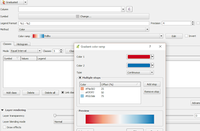
All color ramps, including existing ones, can now be edited.

Other Notable New Features
There are improvements to digitizing in QGIS as well as raster alignment tools, and much more!

Wednesday, October 14, 2015

Video: QGIS Print Composer - Side-by-Side Maps and Atlas

QGIS has a powerful print composer that allows users to create complex maps very quickly.  Two common practical examples include creating: 1) side-by-side (or multiple maps) on the same canvas/layout and 2) a map book or atlas. This week's video looks at these cases: https://www.youtube.com/watch?v=gCISvTfHtZc.


In the video, we will create side-by-side maps of different band combinations of remote sensing imagery of the Salton Sea.  For a related blog post, visit:
http://opensourcegisblog.blogspot.com/2015/08/tutorial-side-by-side-maps-in-qgis.html

We will also use the atlas to take a closer look a battleground states during the 2012 presidential election.

Lastly, I searched high and low, but I could not find any guidance or cartographic reference on creating side-by-side maps. So, I looked through several dozen examples, found a couple of themes, and drafted some suggestions --which you can find towards the introduction--and below.
A few suggestions for creating multiple maps on the same canvas/layout.
In the coming months, we will also re-visit the atlas function in print composer and look at more complex examples.

Sunday, October 4, 2015

Video: Tips for Using QGIS Print Composer

QGIS Print Composer can be a little awkward to use at first.  It is analogous to Layout View in ArcGIS.  We will look at some tips to make it easier to use and understand how to create maps in QGIS.


In the video, we will review a map of 2012 Presidential Election Results, as seen below.


In Part II, I will show you how to create side-by-side map series, which is great to look at changes over time as well as different band combinations in remote sensing.  We will also take a look at creating an atlas or map book, essentially iterating/repeating the map making process by a geographic area.  Lastly, we will take a look at the QGIS Map Showcase on Flickr.

If there is something you would like to see, let me know in the comments section below.

Update #1: Print composer has an add Legend button but in this video I used an image file because I used some fancy rule-based symbology, the legend was not easy to look at. Normally, I would just select add Legend.