Showing posts with label spatial analysis. Show all posts

Sunday, February 21, 2016

Spatial Analysis with GeoDa: Part II - Importing Data and Tools

GeoDa opens as a "floating bar" which you will find nice as you do analysis and realize multiple linked windows can be arranged.  The maps and graphs are interactive, as I'll show in later posts, show selecting features in one window will highlight the same parts in other windows.

When I learn a new piece of software, I always go from left to right.  
File Menu
The "File" menu allows you to import data, save and load projects (self-named *.gda files), and export selected data. In addition, there is a nice Project Information option that tells the title, data source and type, project name, number of observations and fields.

Data Formats
Users can import a wide array of file formats: shapefile, SQLite/SpatialLite, *.csv , .xls, .dbf, .json, .gml, .kml, and MapInfo files.  Remember, are analyzing vector data, so points, lines, and polygons. Remember map projections matter, since spatial weights are created based on distance!
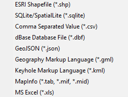
GeoDa does a great job of offering multiple file types to import.
Tools Menu: Spatial Weights
Spatial weights are used to model spatial relationships. Using GeoDa, we can create spatial weights based on contiguity/bordering (think chess moves: rook or queen), distance, and the number of nearest neighbors.  Imagine a grid or matrix that has a row and column for every feature.  The cells are populated using 0/1 for weights based on contiguity (where a feature borders another) or distances for distanced based weights.

Tips:
  • Generally, do not go above 2nd order of contiguity: 1st order contiguity is neighbors, 2nd order is neighbors of neighbors.  Anything beyond this becomes extremely difficult to interpret.
  • The GeoDa Center also has PySAL an open source Python library that can be used to create spatial weights and perform spatial analysis.
The first option is "Select" if you have already created weights.  The second option is "Create."  Here you will a couple of options to examiner spatial relationships in your data.  Which one you choose should be based on the phenomenon you are studying. Like other types of analysis, you will also want to examine how different spatial weights affect your results.
Connectivity Histogram
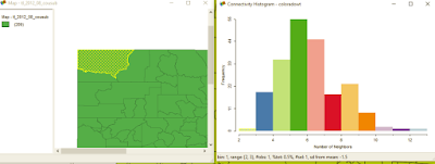
Another one of GeoDa's cool features is a histogram that shows the number of features with a specific number of features.  It can also help you clear up any questions you have about different types of contiguity and how spatial relationships are modeled.

On the histogram a right, the bar/bin for two neighbors is selected.
On the map at left the county is highlighted. Selecting other bars would highlight more features.
Users can also see the distribution of the spatial weights from the histogram.
Shape
In case you tabular data, you can create points from this menu. You can also create a bounding box or grid.  Next time, we'll look at the Table and Map toolbars.

Want blog or YouTube updates?  You can follow me @jontheepi: https://twitter.com/jontheepi
Wednesday, February 3, 2016

Spatial Analysis with GeoDa: Part I - Introduction

GeoDa (https://geodacenter.asu.edu/software) is a free and open source cross-platform program for exploratory (spatial) data analysis or EDA/ESDA and maximum likelihood spatial regression. It has been downloaded nearly 150,000 times and is available on Windows, OS X, and Linux.  ASU's GeoDa center is home to Luc Anselin, e.g. Anselin's Moran's I a local indicator of spatial autocorrelation or LISA.

Update #1: It looks like an older version of GeoDa's source code is available (circa 2014) but not more current versions: https://code.google.com/archive/p/geoda/source

Why use GeoDa?
You are interested in spatial analysis of vector data (points, lines, polygons) and statistics.  This includes looking for clusters of count or rate data, which have similar attribute values, performing regression (asking why a certain pattern exists), observed/predicted values, residuals, and diagnostics. Spatial statistics are commonly used in mainly fields including health, criminology, and pretty much everything!

If you are using GIS for a problem, at some point, you should consider spatial statistics.  The human brain and eye can only see so much.  Some patterns aren't easily apparent.

Spatial analysis can come at a cost ($), and this is why GeoDa is so great!  It is free, open source, and has great capabilities  It even includes some advanced options which you can't currently find in ArcGIS.

Features
GeoDa includes the ability to make choropleth maps, graphs, Thiessen polygons, creating spatial weights using queen and rook contiguity (which requires a high level license in ArcGIS), graphing features by number of neighbors, linked graphs you can 'brush,' LISAs, and regression. We will dive deeper into features later--there is a lot to cover.

A list of GeoDa's features can be found at: https://geodacenter.asu.edu/general-features.  Also, here is a list of its modeling features: https://geodacenter.asu.edu/node/397.

Examples of Use
In 2014, I wrote about a simple use case: examining health insurance rates at the county-level:
http://opensourcegisblog.blogspot.com/2014/04/exploring-health-insurance-estimates-by.html.

More to come...
This is the first part in a series that explores GeoDa's functions and spatial statistics. If there is something you would like to see, leave it in the comment section below.

Want blog or YouTube updates?  You can follow me @jontheepi: https://twitter.com/jontheepi

Thursday, October 22, 2015

Book Review: An Introduction to R for Spatial Analysis and Mapping

I decided to talk a walk on the wild-side and examined R as a GIS for spatial analysis.  I hope to use several of R's spatial statistics packages and to automate tasks--staying within one program.  I highly recommend Brunsdon and Comber's book ($50 on Amazon, Paperback, electronic versions also available).

About the Authors: Chris Brunsdon is the creator of geographically weighted regression or GWR. Lex Comber is a professor at Leeds University.

Four Reasons to choose R as a GIS
1)  You are interested in performing tailored exploratory spatial data analysis (ESDA), spatial statistics, regression analysis, and diagnostics.
  • Of course, R is also way better than ArcGIS and QGIS for summary statistics too. (Notably, QGIS has integrated a R processing toolbox into it. ArcGIS  also has an official bridge to R.)
2)  You already use R for non-spatial data, have lots of code written, and need to analyze spatial data.

3)  You do not want to export your data (or results) from one program into another and back again!

4) You want to be able to publish or share your code with a wider audience.

A great cover to a great book!
Reader Accessibility
The content is extremely well-presented, clear and concise, and includes color graphics. It is not overly technical. Still, R as a GIS and spatial analysis are tough material and is definitely not for the faint-of-heart. The authors assume readers may not have either a R or GIS background, or both. I took a R class in graduate school and occasionally use it.

Additional packages that assist in manipulating and reshaping data, such as plyr, are also discussed. The authors also warn readers that R packages can change over time, causing error messages, but many warn users about recent and upcoming changes.

Overview
In the first 40 pages, you will learn R basics, if you don't already have a foundation. Next, you will learn GIS fundamentals, how to plot data to create a map, taking into account scale, and adding and positioning common map elements like a north arrow and scale bar. This may sound basic but in R nothing is easy!  Of course, the advantage with code is that you can reuse it or may only need to modify it slightly for many maps.

Late in Chapter 5-6 the book dives into spatial analysis.  The last few chapters are probably the best of the book, as more advanced statistical techniques are discussed including local indicators of spatial auto correlation (LISAs), geographically weighted summary statistics and regression.

The book providers a great guide and reference, and I am sure I will be re-visiting it frequently!  Overall, it is a great mix of practice and theory.

Disclosures: 
None, I found and purchased the book on my own.

Sunday, March 8, 2015

Spatial Analysis with QGIS - Part I: Point Data

QGIS 2.8 Wien was released, so it is a good time to review QGIS's basic spatial analysis capabilities for vector data--starting with point data. We will also take a look at a few plugins and the SAGA and R processing toolboxes. Most of the functionality in QGIS is from Ftools, formerly a plugin, now part of base QGIS. There is also the MMQGIS plugin to examine vector data.

In addition, I will make a few recommendations for added features, or point you to another free or open source program that can be used in conjunction with QGIS or simply by importing and exporting data.

Nearest Neighbor Index
QGIS can calculate the nearest neighbor index to assess point clustering.  No p-value is given but the simple trick is to remember that large negative z-scores mean the points are clustered while large positive z-scores mean the data is more dispersed.
No p-values are given but remembering critical values/decision points,i.e. +/-1.65, 1.96,
is the easiest way to know if clustering is statistically significant.
Mean Center and Standard Distance
The mean center, an average of x- and y- coordinates, is an easy way to find the central feature and to examine spatial-temporal trends.  In the case below, the mean of all starting points, by year, for US tornadoes, 2000-2013. The data are grouped by UID, in this case a year variable.  It would be great to also be able to calculate a median center.  Data source: NOAA Storm Prediction Center.
  • In some years, the average was pulled slightly west or east.  Interestingly, the mean is pulled east in 2011, when there was a large 'outbreak' of tornadoes across the southeastern US.

The mean of all 'starting' points for US tornadoes, by year, 2000-2013.
Moreover, there are several point pattern analysis tools, including the standard distance--a measure of dispersion--in the SAGA Processing Toolbox.  More specifically the "Geostatistics" tool, contains a lot of useful functions that can be used.  The output can be  saved and displayed in QGIS.  The NOAA dataset already contains the length from start to end, but you could also calculate this by creating a distance matrix in QGIS.


The SAGA Geostatistics Toolbox in QGIS
Ripley's K
Ripley's K helps to determine clustering at different distances.  It can be implemented through the R processing toolbox in QGIS, using R's SpatStat package, or CrimeStat.

Heatmap
You can download the Heatmap plugin or use a built-in live/dynamic heat map when you go to style a layer.  For the latter, make sure to move the rendering slider to 'best' for a nice looking heatmap. Here is an example using the dynamic heat map to look at homicides in Philadelphia. Data source: OpenDataPhilly.   In future posts, we will also look at alternatives to heatmaps, like gridding/quadrat analysis.

QGIS has lot of neat options for styling vector data, including a dynamic heatmap
that changes as you zoom in and out.
 (Note: In ArcGIS kernel density tool (not to be confused with point density) remains separate from the base software and has to be purchased through the Spatial Analyst Extension).

Grouping Analysis
Lastly, grouping analysis can be examined using PostGIS, which allows for a wide variety of spatial queries using SQL, or CrimeStat.

Near future...
We will look at spatial analysis of line and polygon data as well joining points for analysis.

GME and ArcGIS
When using ArcGIS, be sure to check out the free windows-based program Geospatial Modelling Environment, or GME formerly 'Hawth's Tools," http://www.spatialecology.com/gme/.  GME has a long list of helpeful commands: http://www.spatialecology.com/gme/gmecommands.htm.

Tuesday, February 17, 2015

SaTScan 9.4 released, better than ever!

SaTScan is a program for detecting clusters over space, time, and space-time.  It is available for Windows, Mac OS X, and Linux. SaTScan 9.4 was recently released and it is better than ever!  The data import wizard now allows shapefiles to be read and and a graphing feature has been added to help examine temporal trends. Visit the link for a better look at the rundown of new features.

The Import Wizard now reads shapefiles.
In previous posts, I've covered the types of files you will need and how to aggregate data in preparation for importing it. Since version 9.2, SaTScan has had the ability to export *.kml and *.shp so that the most likely clusters can be viewed in GIS software. (Aside: Google Earth Pro is now free! https://www.google.com/work/mapsearth/products/earthpro.html)

Below is an example looking at clusters of low immunization rates in California from the journal Pediatrics. Free full-text: http://pediatrics.aappublications.org/content/135/2/280.full.pdf+html

In SaTScan, using lat/long coordinates, allows users to export to *.kml and *.shp.
Google Earth opens the *.kml automatically when a run is complete.
A few tutorials are being made, http://www.satscan.org/tutorials.html and sample data is available. Be sure to read the expertly written user's guide before running: http://goo.gl/rHg7M6. and the long and varied bibliography of analyses conducted with SaTScan: http://www.satscan.org/references.html

Update #1 (2/20/15)
Scan statistics can also be implemented in R's Spatial Epi Package and rsatscan.

Sunday, January 25, 2015

Free Five Course Series on QGIS Starts Soon

Del Mar College is offering a free online course that gives an introduction to GIS and QGIS.  The course is titled "Introduction to Geospatial Technology Using QGIS" and is available from the Canvas Network.  The five-week course is self-paced and runs from February 23rd to March 27th. Already 1,000 students are signed up. The courses were created with funds from the National Science Foundation (NSF) and US Department of Labor.

It is great to see a course geared towards QGIS!  The course hits on components of the core competencies for entry level geospatial occupations as outlined here.  It includes lectures and hands-on exercises.  If you can't wait or can't find time, the course materials for this course and others are available at GitHub: https://github.com/FOSS4GAcademy.

From the OSGeo listserve, this course is part of a larger effort to educate about GIS and FOSS GIS called "Geo For All" and GeoAcademy.  This is the first course in a sequence of five, so more courses will be on the way!

The other four courses are:
  • Spatial Analysis Using QGIS
  • Data Acquisition and Management Using QGIS
  • Cartography Using QGIS
  • Remote Sensing Using QGIS
If you know someone who is interested in GIS or QGIS and likes independent study, it looks like a solid opportunity!  
For more information: https://www.canvas.net/browse/delmarcollege/courses/cn-1681-intro-qgis

Course offerings from Penn State University (PSU) and Coursera: 
http://opensourcegisblog.blogspot.com/2014/08/free-online-mapping-classes-from-psu.html

Wednesday, January 7, 2015

FGBASE: Fast Grid-Based Spatial Data Mining

FGBASE is a new open source software for using scan statistics on gridded data.  Unlike SaTScan, FGBASE only currently runs on Mac OS X (10.6, 10.7, and 10.8) instead of Windows and also allows for its source code to be downloaded here: http://www.fgbase.org/download-fgbase/.  The software was specifically created for environmental epidemiology but has potential applications to any fields of study concerned with finding clusters.

Analyzing aggregate data, using either software package, helps to speed up computationally intensive equations for finding spatial, temporal, or spatiotemporal clusters.

Comparison of FGBASE and SaTScan


FGBASE
SaTScan
Operating system(s)
Mac OS X
Windows, Linux,
Mac OS X
Open source code
Yes
No
Geographic output
In app
New: Export to KML or SHP
Sample data sets
Yes, 1
Yes, several
Documentation
TBD
Extensive
Publications
1
Extensive, hundreds
           
Although FGBASE comes with some sample data (available at: http://www.fgbase.org/user-data/), the program was only recently released.  Aside: The data set is different from the one used in the published paper, so you will notice differences when looking at your screen.  What data sets you will need and how they are structured is available at: http://www.fgbase.org/user-data/.

Clusters can be examined using a data-driven approach answering the question: where are the clusters?  Or, a hypothesis-driven approach can be used: are there clusters relative to a source(s) of exposure, where entities (factories,etc.) may be responsible for the clustering of cases.

A stock screenshot of FGBASE. Source: IJHG
I downloaded and installed FGBASE.  I will check back in with more impressions in a few months. Adding documentation, with a tutorial, or even a short YouTube video could greatly aid users.  I also plan to blog about getting data into SatScan and interpreting results later in the year.  Since FGBASE's source code is public, hopefully this will speed further development of the program and aid troubleshooting.

Read more at the International Journal of Health Geographics:
http://www.ij-healthgeographics.com/content/pdf/1476-072X-13-46.pdf

See also:
Treescan
R: Spatial Epi Package
There is also an experimental SaTSViz plugin in QGIS but I have not had a chance to look at.

Tuesday, August 19, 2014

Free Online Mapping Classes From PSU and Coursera

Course dates: Last updated on 12/16/2014

Penn State has an online Open Web Mapping Class for free using open source software.  The course materials are available at: https://www.e-education.psu.edu/geog585/ through a creative commons license. You can also take the paid version of the online course for credit.  Coursework includes QGIS, GDAL, OGR, GeoServer, TileMill, Openlayers, and OpenStreetMap.  Penn State also has several map-related classes on Coursera.

Coursera has at least six relevant classes to GIS, GPS, and more during this upcoming fall 2014 and winter 2015 sessions.  Please note some of the courses do offer different tracts that range from basic to technical in difficulty.  This fall and winter there are exciting course offerings!

Introductory
One course is on Geodesign
Intermediate-Advanced
Another is on GPS, mapping, and spatial computing
Other-related
Also don't forget, ESRI does have some free and low cost tutorials for ArcGIS on their training page as well: http://www.esri.com/training/main.  Be sure to checkout Directions Magazine's articles and webinars for other opportunities.

If anyone else has any that they would like to share, feel free to write them in the comments section below!

Update #1:  Noteworthy addition:  ESRI is offering a free MOOC or massive open online course entitled "Going Places with Spatial Analysis".  Head over to the link below to signup for notification when registration begins, which is shortly: Going Places Signup / Start Page

Tuesday, April 15, 2014

Exploring Health Insurance Estimates by County Using GeoDA

Health insurance has been an important topic over the last several months, with the opening and closing of open enrollment at HealthCare.gov.  Most recently, the Census released its first estimates of health insurance coverage at the census tract level.  Typically, estimates have been made for county-level data which is what I explore here from the Small Area Health Insurance Estimates (SAHIE) Program.

I used the latest build of GeoDA 1.5/Beta/preview to explore spatial patterns in 2012 estimates for the percent of population that is uninsured under age 65 by county.  I examined a univariate Local Moran's I and a bivariate example using the percent below the poverty level.

If you have not used GeoDA before to conduct exploratory spatial data analysis (ESDA), you need to give it a try.  The latest build features more data import/export and editing options, a significant improvement over earlier versions.
Some of GeoDA's features are either a) not present in ArcGIS and its extensions or b) only found in ArcGIS Advanced, formerly ArcInfo, namely the creation of spatial weights using polygon contiguity/adjacency. (Note: You can create weights in ArcGIS, based on distance for example.)
To help keep all maps uniform, I imported the results into QGIS. Click on any image below to magnify it. You can find definitions for the terms and statistics used here.

Map of Percent Uninsured by County
Regionally, the South and West US have a smaller percent of counties with low rates of uninsured compared to the Midwest and Northeast. Or rather, they have a higher percent of counties with high rates of uninsured.
For the official map, for comparison, visit here.

LISA Map of Percent Uninsured by County
The map below shows clusters of counties with high, low, low-high, and high-low rates of uninsured.  Light grey areas were not statistically significant.  Spatial weights were created for queen contiguity, 1st order/neighbors.

Global (p=0.02) and local autocorrelation are present.  
The Moran scatter plot of percent uninsured vs.
lagged/neighboring counties has a r-squared value of 0.74 

LISA Map of Percent Uninsured and Percent Below the Poverty Line
Lastly, I examined a bivariate LISA of the percent uninsured and percent below the poverty line (all ages). For this map, I also included the outline of states.  Interestingly, there was no across-the-board global association, as one might expect.  However, state policies undoubtedly affect the percent insured.

No global autocorrelation (p=0.51) but local autocorrelation is present in parts of states or throughout most of particular states, for example the low percent uninsured (and low percent in poverty) in Massachusetts which underwent significant healthcare reform in 2006.  What do you think about some of the other states?

Affordable Care Act Implementation
Unfortunately, some of the states that could benefit the most from the Affordable Care Act (ACA) did not move to implement, as evidenced in this map from the Commonwealth Fund.

Those States sprinting ahead with implementation and those sitting it out.
Bottom line: GeoDA and QGIS are a potent combination.  GeoDA's import, export, and data editing features are much improved.   It is a vital tool for learning and conducting spatial analysis.  However, a few other components of GeoDA are worth mentioning including: making cartograms and conditional maps, connectivity histograms, and performing spatial regression.  As implementation of the ACA moves ahead, it will be interesting to see changes or lack of changes in the percent insured.

QGIS Tip:  Save the symbol styles (categorized) for the cluster types (LISA_CL variable) after you make them, since they can be saved, loaded, and used again for any map layer created in GeoDA as long as you don't change the default variable names.  This is a huge time saver. 

Tuesday, February 4, 2014

CrimeStat IV Released...Not Just for Crime Analysis...

CrimeStat IV was recently released, but you do not need to be a crime analyst to appreciate it or find it useful. CrimeStat is a lightweight piece of freeware with heavyweight analytical capabilities. 

Last year, I used CrimeStat to show different programs performing basic density analysis.  But, CrimeStat can really do a whole lot more!  CrimeStat IV boosts 60 different routines, so there is plenty of analytic power in this Windows-based program.

An abbreviated list of features:
  • Importing two files with X/Y coordinates
  • Creating a reference grid
  • Using different types of distance measurement
  • Measures of Spatial Distribution (Mean center, standard distance,etc.)
  • Spatial Autocorrelation Indices
  • Distance Analysis (Nearest neighbor, Ripley's K,...)
  • Hot spot analysis 
  • Spatial Modeling/Interpolation
  • Journey-to-crime analysis
  • Spatial Modeling (several types of regression models)
  • Time-series forecasting
First, CrimeStat is not a GIS.  For example, you cannot view, create, or edit spatial data or visualize any maps/GIS-related files within it.  Rather, it is a program that imports, conducts spatial analysis, and exports results for being imported into any GIS.

On the other hand, you can import GIS-related file types such as shapefiles, *.dbf files, and ASCII/delimited files (i.e. *.csv).  Once you have decided on what type of analysis you are going to run, be sure to read how to import your data.  Once past this minor obstacle, you will be free to conduct your analysis...for free!

CrimeStat's tabs make navigation easy.  The program opens to the Data Setup tab--which is a necessary first stop. Click to magnify the screenshot below.
Like many free and open source programs, learning on how to import your data is a crucial first step!  Understanding your projection, as always is also key, especially when moving the results back into a GIS.
The Spatial Description analysis tab shows the basic premise of CrimeStat.  After loading your data, the program makes the necessary computations and 'saves result to'/Saves output to a folder for importing into a GIS.
Since this is version 4.0, CrimeStat's documentation is well organized by type of analysis.  The website contains plenty of exercises and sample data to minimize.  I was a bit disappointed that a Quick Guide is actually more like previous' versions workbooks--and exceeds 200 pages.  I would recommend starting at Chapter 1 and reading each of the first few chapters on it own.  You can then move on to specific analytic chapters--as needed.  Still, all the documentation is in order. Lastly, you will find real world case studies by leading researchers.

In sum, pairing CrimeStat IV with a free GIS, such as QGIS, makes for a powerful and free combination!

Friday, March 22, 2013

Spatial Analysis Tools

A number of open source spatial analysis tools are available.  Often, they are created by leading researchers and practitioners in the field.

For ESRI's ArcGIS, different license levels leave out key features.  For example, you will need an ArcGIS Advanced (formerly ArcInfo) license to create Thiessen/Voronoi polygons.  An ArcGIS basic license with Spatial Analyst extension will allow you to perform geographically weighted regression (GWR) but you will need an ArcGIS advanced license to create spatial weights based on contiguity (i.e. queen, rook). ESRI does list what is included in the different versions of its software in a functionality matrix you can find here: www.esri.com/library/brochures/pdfs/arcgis10-desktop-functionality-matrix.pdf.

Fortunately, alternatives are available -- including open source tools that are accessible and will link into ArcGIS.  I touch on three here, but numerous other tools, packages, and plugins exist mainly based on Python.

Geospatial Modelling Environment, formerly known as "Hawthe's Tools."  A full list of its commands can be found at: http://www.spatialecology.com/gme/gmecommands.htm

Arizona State University provides a number of spatial tool including GeoDA and PySAL.

SaTScan dives into the temporal and spatiotemporal dimensions.
http://www.satscan.org/

GWR4 is available for performing GWR for poisson data and other non-linear data distributions.  It can be found at: http://gwr.nuim.ie/node/6

In future posts, I will show several examples and, time allowing, also compare the results with ArcGIS.  

Friday, July 6, 2012

Spatial Analysis in QGIS

It is time to talk about spatial analysis.  Many open source GIS software have at least some analytic capability--more functionality is being added frequently.  Earlier, I showed a simple map of wifi locations in New York City using QGIS.  Let's take a look at the density or in this case area surrounding these points.  Since I have had trouble with kernel density, let's use Thiessen/Voronoi polygons.  Interestingly, these are only available with an ArcInfo license in ArcGIS, which is extremely expensive.  I am not going to compare results here, but let's see what the resulting map looks like.  The lighter/whiter the color the less area between wifi locations and the better the wifi availability.  (Of course I don't show whether the wifi locations are free or cost-based on this map).  Not bad for free data and free data analysis!  I used the nifty vector transparency plugin from QGIS so you can also see some of the land cover.

Click on the map and a larger version will appear.