Wednesday, January 22, 2014

A Free Look at the Luxor Hotel in Las Vegas

A while back, I wrote a brief post on FUSION LIDAR viewing software.  In this post, I will use real world data with the FugroViewer, freeware from the Dutch company Fugro.  

I downloaded LIDAR data from EarthExplorer -- focusing on downtown Las Vegas, specifically the pyramidal Luxor Hotel. The hotel's shape is so constraining that it needs specialized elevators, which tilt and shimmy, up to visitors' rooms. Of course, it is noteworthy to mention that LIDAR is also being utilized to search for ancient lost pyramids.

At first glance, the Luxor hotel is hard to pick out.  However, increasing the point display size from the menu helps to highlight its unique shape. Alternatively, I could also have tried turning off some returns or chosen to highlight specific values for different LIDAR attributes. Redder points have higher elevation values.  Click on the screenshots below to magnify them. 

Can you see the Luxor Hotel?
LIDAR points can be converted into TINs to help visualize what we are looking for.  The three panes below show three different views: overhead (left), a cross-section profile (upper right), and 3-D (bottom right).

Left: Overhead view with a view selected with the Profile tool.  Top Right: View from the Profile Tool.  Bottom Right: A 3-D view of the TIN generated from the LIDAR data clearly showing the Luxor Hotel and nearby attractions.

A slightly cleaned up 3-D view of the Luxor Hotel.
Lastly, LIDAR can be used to measure dimensions with great precision and accuracy.  The Luxor Hotel is listed at 107m.  Using the measurement tool, a height of ~ 107m  (104.7m) is calculated.

How tall is the Luxor Hotel?  Here, a quick measurement calculates about 105 meters-close to its actual 107m.
UPDATE on 1/25: I was able to add in imagery in Fugro viewer.  It has to be a single-band georeferenced image.

NEW: LIDAR data with satellite imagery underneath.

Google Street View of the Luxor and surrounding area

See also:
FUSION Viewer
LIDAR Exercises

Monday, January 20, 2014

Be Weather-Ready...The Open-Source Way...

More snow is on the way for the east coast, but it is not the 5 to 6 inches of snow that has me excited!  Weather forecasts and data are probably one of the best examples of an open-source philosophy.  Sure there is privatization, since there is always a new innovation or buck to be made, but the amount of data collection, visualization, and analysis is growing more and more impressive.  Even large companies such was the Weather Channel turn to open source.

Maps play a vital role in communicating location-based weather-related risks.  A lot of web-based weather maps and and apps are out there. I won't dare creating a list, since I will probably miss your favorite. A quick Google search even reveals OpenWeatherMap.org complete with an API.

The National Weather Service (NWS) has several different open web-based mapping options.  Most recently, I stumbled upon their ESRI-based app:NWS Enhanced Data Display.  Since it is a simple, easy-to-use well designed app, it is worth a blog post!  Click on the image below to magnify the screenshot.  It is an improvement over other NWS products and similar maps out on the web, because it is designed with the user(s) in mind.

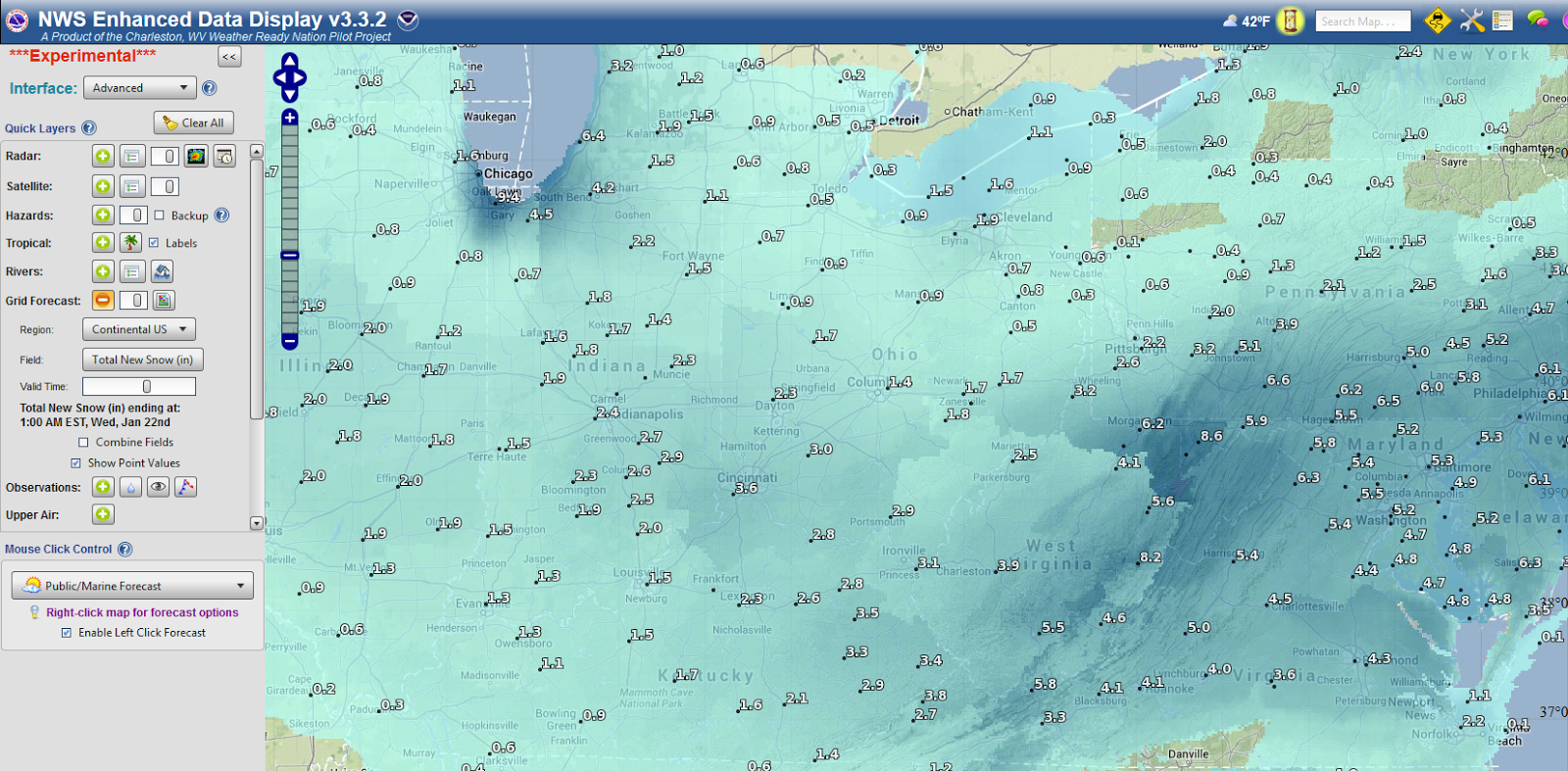
The NWS Enhanced Data Display - Snow Predictions
First, different types of users--whether concerned with basic hazards, fire, marine, or aviation risks, can be selected.  The choice of user changes the app to focus on what different users need to see (and more importantly what they don't need to see!).  Brillant!

Clicking on individual weather stations, or searching for one, brings up all the needed forecasts and hourly graphs.  Users can also add their own map files and draw polygons to get forecasts for specific regions, which may cross several state boundaries. There are also some basic storm-tracking/analytical functions such as a storm's time of arrival. Lastly, when a user is done, they can even share the map by clicking a "Save/Share" button at the bottom of the screen. A small url is generated and can be shared.

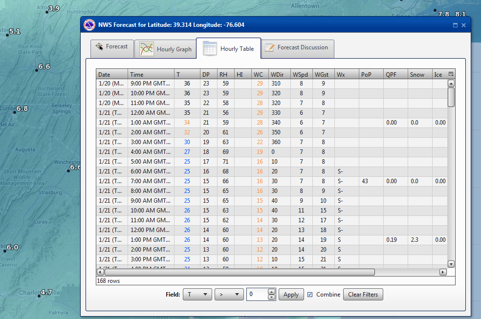
Hour-by-Hour Predictions...
Overall, a simple weather map that is easy to use is one that will be used more!  So, next time you hear your local forecast, don't forget to log-on to the the web to check out the specifics and even share a map with family and friends!

Also check out:
NWS GIS Data Portal
NWS Aware Report

Friday, January 3, 2014

Happy New Year!...What's Ahead This Year...

What can you look forward to from the Open Source GIS Blog--in the year ahead?  Well I hope to get the New Year off to a good start by finishing some R code for cleaning messy address fields

Most importantly, I will be featuring more ArcGIS vs. Open Source GIS "showdowns/throw downs"--comparing similar features in paid vs. free and open source GIS software, focusing on spatial analysis and other features.  These are one of my favorite posts to write but usually take the most time to create.  Here, you can check out one past post about kernel density in ArcGIS vs CrimeStat. I cannot guarantee open source GIS will win every time, but the journey will be fun!  In addition, we will be taking a look at download and using Landsat 8 data.  I also plan on posting more book reviews on books about open source GIS and other relevant topics.
Announcement:  If you are interested in Android App Development, check out the Coursera course "Programming Mobile Applications for Android Operating Systems" from the University of Maryland.  I will taking it and hope to see you there!  The course is free.  However, Coursera offers a Verified Certificate for $49--which may be worthwhile for professional development.  The course beings on January 21st, and lasts 8 weeks, so if you are interested get registered now!  Check out the video below!


I started this blog about two years ago...this will be third year!  Each year, I try to post higher quality information so stay tuned.  By the numbers, a few statistics:
  • The blog has had a modest 5,700 page views since its first creation in February 2012. 
  • Viewers have come from many different countries. 
    • The most frequent users hail from my home county of the US, Latvia (real or bots/spam?), Germany, UK, Russia, France, Canada, Australia, China, and India.  However, many different countries have viewers including: Brazil, Portugal, and South Korea, and the list goes on! 
  • There have been 56 posts - each with an important piece of information, software, analysis, web map, or links to great resources.
  • By browser: 35% of page views have been in Firefox, 27% from Chrome Browsers, 23% from Internet Explorer, and the remainder from other mobile browsers.
  • By operating system, most users are using Windows (74%), Mac (8%)--with reminder from Linux and mobile OS.
If there is something you would like to see on the blog, feel free to write in the comments below.  Again, happy new year!