Showing posts with label NOAA. Show all posts

Thursday, September 3, 2015

Tips for Using LIDAR and LAStools in QGIS

LIDAR is an important technology that is undergoing continuous and expansive growth and predicted to reach $1 billion by 2020.  A recent report also describes ongoing developments in LIDAR in Europe. NOAA has a great one-hour Introduction to LIDAR that I recommend checking out: http://coast.noaa.gov/digitalcoast/training/intro-lidar

Source: Allied Market Research, https://www.alliedmarketresearch.com/lidar-market
LAStools is the popular LIDAR processing tool created by the developer of *.las and compressed *.laz formats.  There is a standalone program as well as toolboxes for a variety of programs including QGIS. We will cover a few tips and wrap up with a look at Wizard Island, Crater Lake, Oregon.

Linking LAStools with QGIS
Linking the two has gotten much simpler since QGIS 2.4.  Simply download the *.zip file from: http://lastools.org/download/lastools.zip.  Unzip the file, and copy and past the LAStools folder into a simple directory like "c:/" If you have QGIS running, close it before proceeding.

Tip #1: Users often copy the folder to a folder pathway that is complex and includes spaces like c:/Program Files/ or c:/My Documents. It will not work. Again, use simple path names, no spaces!

Tip #2: This also applies for any files you import with LAStools or export during processing in QGIS.

After doing this, start QGIS, go to the Processing Toolbar, click "Tools for LiDAR Data"->Activate-> and enter or browse to the folder pathway. I've been using LAStools with the most recent version of QGIS (2.10) and have not had any problems yet.

Linking LAStools and QGIS has gotten much easier!
Click "Ok", then head over to the Processing Toolbox side-panel, and you will see the tools ready-to-use!

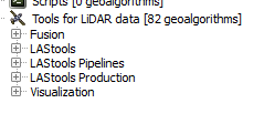
Expand and see a wide range of tools at your disposal!
Note: The LAStools Production or PRO tools are for batch processing.

Tip #3: If you run a tool and nothing happens, be sure that NONE of the folder pathways, for importing data and exporting results, are complex and/or contain spaces.

Tip #4: Be sure to read the "Log" for important information and troubleshooting.


Tip #5:  When using lasview in QGIS, pressing Space bar changes your ability to navigate from zoom, tilt,pan, and translate.  In the upper-left of the window, you will see the navigation type change as you press it.

Furthermore, right-clicking the mouse, brings up a menu for changing the view of LIDAR, from selecting returns, how to symbolize/color data.

The right click menu in LAStools

Tip #6: To get a 3D view, press Space bar until Pan is displayed, if is not already.  Click and hold your mouse, then move it up to the top of the screen and voila!


Wizard Island, Crater Lake, Oregon, Data from: Open Topography. lasnoise was also used.
See also:
OpenTopography
Digital Coast
3D Elevation Program
Google search for "County lidar" and State LIDAR

Tuesday, June 16, 2015

QGIS vs. ArcGIS: Adding Magnetic Declination

This is a QGIS vs. ArcGIS throwdown.  It has been a while since I did the last one on kernel density and Thiessen polygons.  Recently, I was looking over new QGIS plugins and one in particular caught my eye: the QGIS Magnetic Declination Plugin. Magnetic declination is simply the difference between geographic and magnetic north, caused by the earth's magnetic fields. This difference also changes over time. ESRI has a nice technical article on their blog.

NOAA Historical Magnetic Declination Viewer:
http://maps.ngdc.noaa.gov/viewers/historical_declination/
ArcGIS
Adding a declination diagram in ArcGIS can be a bit tricky. As of version 10.2, there is a template and several tools to assist.  You will need a Standard or Advanced license plus the Production Mapping Extension.

QGIS Plugin
On main toolbar in QGIS, go to Plugins-->Manage and Install Plugins--> and search for Magnetic Declination. After a quick installation, you will see a green and yellow star appear on your toolbar. Click it and you will see the toolbar open below.

You can select a location off a map, such as OpenStreetMap, calculate it and map it!  Best of all, the resulting compass rose and measurements also appear in QGIS Print Composer.  Under the options tab, you can also change the color. I found it helpful to change it to black.

Steps:
  1. Click LON/LAT from map
  2. Choose any options
  3. Press "Calculate" button
  4. Then "Draw Compass Rose"
Screenshot of the plugin, steps, and buttons.

  • Click any of the screenshots below to get a closer look.
Up close example with  declination, true, and magnetic north shown in Greenland
where declination is much greater.
Showing positive, zero, and negative declination in the US.

The plugin is very new but is being updated, so stay tuned!

Update #1
I forgot to mention that you can customize the size/diameter of the compass rose--as large or as small as you need depending on whether you are interested adding it to a small scale map or a large scale map.

Wednesday, April 15, 2015

Global Climate Monitor: "Getting Knowledge from Data"

The Global Climate Monitor (GCM) was created by researchers at the University of Seville to "model and [g]eo-visualize global climate data and climate-environmental indicators." If you are familiar with NOAA's monthly climate reports, you will find many of the same types of information here.   Finding and accessing weather and climate data can be daunting.  So, any website that tackles the challenge of making spatiotemporal data more accessible gets kudos.

Users can query several different datasets.
Users can query the GCM database by monthly and annual values as well as normals and trend back to 1901.  Here values are displayed in a grid (with each cell representing roughly 34 x 34 miles)

Moreover, the website allows users to easily select and interact with data across the globe.  In addition, a data download tool has recently released.  It allows users to download the onscreen data as a square grid in many different commonly used formats (*.kml, tiff, jpeg, csv, xlsx, and shp).

In order to download data, look for the little gift/package button on the right-hand side toolbar--at the bottom.

The three goals of the project are: 1) Analysis and management of climate information, 2) spatio-temporal climate variability, and 3) Applied Climatology.

Lastly, the project uses open source web map development tools including GeoServer and OpenLayers.

For more information, visit the main GCM website at http://www.globalclimatemonitor.org/ or the project page at http://grupo.us.es/climatemonitor/.

Above: Monthly temperature anomalies for February 2015.  The website allows users
 to choose a basemap, change transparency of layers, and identify values. 
The project leverages popular free and open source web map development tools.

Sunday, March 8, 2015

Spatial Analysis with QGIS - Part I: Point Data

QGIS 2.8 Wien was released, so it is a good time to review QGIS's basic spatial analysis capabilities for vector data--starting with point data. We will also take a look at a few plugins and the SAGA and R processing toolboxes. Most of the functionality in QGIS is from Ftools, formerly a plugin, now part of base QGIS. There is also the MMQGIS plugin to examine vector data.

In addition, I will make a few recommendations for added features, or point you to another free or open source program that can be used in conjunction with QGIS or simply by importing and exporting data.

Nearest Neighbor Index
QGIS can calculate the nearest neighbor index to assess point clustering.  No p-value is given but the simple trick is to remember that large negative z-scores mean the points are clustered while large positive z-scores mean the data is more dispersed.
No p-values are given but remembering critical values/decision points,i.e. +/-1.65, 1.96,
is the easiest way to know if clustering is statistically significant.
Mean Center and Standard Distance
The mean center, an average of x- and y- coordinates, is an easy way to find the central feature and to examine spatial-temporal trends.  In the case below, the mean of all starting points, by year, for US tornadoes, 2000-2013. The data are grouped by UID, in this case a year variable.  It would be great to also be able to calculate a median center.  Data source: NOAA Storm Prediction Center.
  • In some years, the average was pulled slightly west or east.  Interestingly, the mean is pulled east in 2011, when there was a large 'outbreak' of tornadoes across the southeastern US.

The mean of all 'starting' points for US tornadoes, by year, 2000-2013.
Moreover, there are several point pattern analysis tools, including the standard distance--a measure of dispersion--in the SAGA Processing Toolbox.  More specifically the "Geostatistics" tool, contains a lot of useful functions that can be used.  The output can be  saved and displayed in QGIS.  The NOAA dataset already contains the length from start to end, but you could also calculate this by creating a distance matrix in QGIS.


The SAGA Geostatistics Toolbox in QGIS
Ripley's K
Ripley's K helps to determine clustering at different distances.  It can be implemented through the R processing toolbox in QGIS, using R's SpatStat package, or CrimeStat.

Heatmap
You can download the Heatmap plugin or use a built-in live/dynamic heat map when you go to style a layer.  For the latter, make sure to move the rendering slider to 'best' for a nice looking heatmap. Here is an example using the dynamic heat map to look at homicides in Philadelphia. Data source: OpenDataPhilly.   In future posts, we will also look at alternatives to heatmaps, like gridding/quadrat analysis.

QGIS has lot of neat options for styling vector data, including a dynamic heatmap
that changes as you zoom in and out.
 (Note: In ArcGIS kernel density tool (not to be confused with point density) remains separate from the base software and has to be purchased through the Spatial Analyst Extension).

Grouping Analysis
Lastly, grouping analysis can be examined using PostGIS, which allows for a wide variety of spatial queries using SQL, or CrimeStat.

Near future...
We will look at spatial analysis of line and polygon data as well joining points for analysis.

GME and ArcGIS
When using ArcGIS, be sure to check out the free windows-based program Geospatial Modelling Environment, or GME formerly 'Hawth's Tools," http://www.spatialecology.com/gme/.  GME has a long list of helpeful commands: http://www.spatialecology.com/gme/gmecommands.htm.

Wednesday, February 25, 2015

ESRI's Open Data vs.Data.gov

ESRI recently announced its open data website (http://opendata.arcgis.com/), which was in beta in mid-2014, so I decided it was a good time to take a look.  More and more open data is being published in a variety of places, by different organizations.

I thought it was only fair to make some comparisons. Because ESRI's user base and audiences are large, I decided the best comparison is Data.gov.  The only drawback is that Data.gov has been in existence longer.

Of course, open data is important regardless of the platform.  Moreover, open data can be imported into any free and open source GIS.
"[Open data's] impacts include... cost savings, efficiency, fuel for business, improved civic services, informed policy, performance planning, research and scientific discoveries, transparency and accountability, and increased public participation in the democratic dialogue." - Data.gov
One big difference between the sites is ESRI's contains lots of data from States vs. federal (state, and local) data found in Data.gov.  ESRI touts that it works with more than 380,000 organizations across the globe, so more open data is on its way!

A table comparing ESRI's Open Data vs. Data.gov
One big advantage of ESRI's Open Data page is being able to view geographic data in your browser immediately and even see some attribute data.

Data.gov's metrics pages are really neat including one on data sets published by agency by month: . Most data sets come from NOAA and USGS, which can be accessed in several different ways.   Obviously, a lot of the pages linked from Data.gov either use ESRI formats or are driven by ESRI products.  For developers it is also important to note that Data.gov has challenges/competitions. So be sure to check their website and social media! 

Data.gov helps you get started with browsing categories.
Currently, Data.gov has more data sets but it will be interesting to see how much ESRI can catch-up in the months to come.  It is a win-win situation for any data scientist or GIS analyst.  As open data sites get larger, they can become harder to search and navigate.  In sum, both sites will have to keep innovating to help bring out the best in open data and analysis.

Wednesday, June 6, 2012

Weather, GIS Viewers, and Data

With hurricanes, tornadoes, flooding, and hot weather upon us, weather and GIS are now as important as ever.  Fortunately, there are a number of online sources of open source meterological data and GIS viewers.  In addition, there are servers and databases that can be tapped into for continously updated of information.

NowCoast is a free real-time web mapping portal to information from the National Oceanic and Atmospheric Administration (NOAA).  The web mapping application is good and there are plenty of layers to choose from.  There are even WMS servers to tap into here: http://nowcoast.noaa.gov/help/mapservices.shtml?name=mapservices.  The National Weather Service (NWS), whose parent agency is NOAA, also has a page separated by filetype: shapefiles, KML/KMZs, and web services. A screenshot of nowCOAST appears below.

It is also worth mentioning that the NWS is in the process of upgrading its website which you can check out here: http://preview.weather.gov/

The Weather Underground's WunderMap, also free, provides a number of features and layers.

Intellicast also has an interactive weather map. Many weather websites also offer low cost subscription plans that upgrade the amount of features, data, and maps you can visualize.  Some sites are fee-based, but also provide free trials.

If you are more interested in climate and long-term trends be sure to check out the National Climate Data Centers (NCDC) Interactive Data Online Page.  Other resources are your local or state meterologist office, often affiliated with a university.

In addition, a number of very low cost and free mobile weather and radar apps are also available for Android and iOS devices.  Lastly, if you are not satisfied with your current weather website, check out this listing of 150 weather sites for North America.

Update #1: Be sure to check out this recent blog post on the NWS Enhanced data viewer:
http://opensourcegisblog.blogspot.com/2014/01/be-weather-readythe-open-source-way.html