Monday, August 24, 2015

Making Maps with 'Google My Maps', Part II

Now we will look at more features, performance, and wrap up with some strengths and limitations of My Maps.  If you missed the first post, you can check it out here!

Symbology/Icons
Google includes a set of stock symbols that can be added to your map. Clicking on a category in a layer will bring up the option to change the marker color as well as add different icons.  Google has a nice stock selection of icons for: business, crisis, facilities and services, points of interest, recreation, and transportation.
Google has a nice set of stock icons.
You can also add custom icons at the bottom of this pop-up by linking to an image's web address.

Polygons in KML
Adding polygons will slow down your maps performance, currently, when they are clicked the polygon also shows the points that make it up--a strange sight--compared to other web publishing platforms.

Labeling
You can add labels by clicking the style paint brush, but your map will also take a performance hit. However, even with lots of labels, performance remains very respectable.
Adding labels will decrease the performance of your map.

Set Default View/Extent
Click the three vertical dots on the "Add Layer" menu (not the individual layer), and you will see the option to set and confirm and default view/extent, you can zoom in/out and pan and click this to set it.
Setting a good default view can significantly increase your map's appeal.

Limitations
Google has a nice table of file limits at: https://support.google.com/mymaps/answer/3370982?hl=en. Maps are limited to 10 layers, 10,000 features per map (2,000 per layer), maximum of 50 attribute columns, 5 MB for KML/KMZ, and 2,000 rows/points and up to 40 MB for other file types.
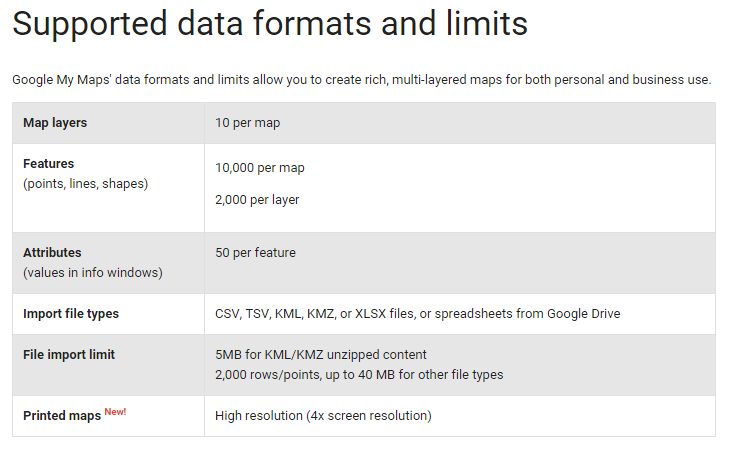
Google's clearly lists the limits for data uploads.
Interestingly, maps can be printed in HD up to 4K resolution. The ultra-high definition revolution is upon us!

Conclusion
Google has developed a nice user friendly interface to allow anyone (even non-mappers) to create free interactive maps. Very cool!!  It will be interesting to see how much My Maps is developed/improved, how quickly/slowly, or whether it stays the same.

Monday, August 17, 2015

Making Maps with 'Google My Maps', Part I

Google may be moving away from making software, like Google Earth desktop--the Pro version was made free--but they still have a few tricks up their sleeve.  Recently, Google made a solid entry into the web publishing domain by giving users the tools to create more sophisticated online maps.  Gone are the days of just adding placemarkers, and now users can add spreadsheets (automatically geocoded) and *.kml files.

As of mid-summer, users can now create and manage their own maps via Google Drive, called "Google My Maps" or simply "My Maps."  All you need to do is setup a free Google Drive account, click on "My Drive" at the top, then "New File", and "Google My Maps"

Google created a very user friendly way for users to make online maps from Google Drive.
There are nine different basemaps to choose from.  Adding layers is easy.  Simply, click the link "Import" to add data or "Add Layer" to add additional layers on top or below.  You can add *.csv, *.xlsx, or *.kml files.  You can directly import files by searching your Drive or import them from your desktop.  If you use a spreadsheet, Google will prompt you to identify the location field or field(s) whether an address or placename as well as how to identify/name your features.


In this example, we will look at a spreadsheet of Substance Abuse Clinics (2011) from the City of Chicago of Data Portal.  After clicking "Import, we are asked to select the location field(s). It can handle addresses in a single or multiple fields.  Next, you will be asked what name/title for your places should be.

If Google has problems geocoding a spreadsheet, you will receive a warning.

Next, we will symbolize the markers by "Population Served" or age groups that each clinic serves. You can also change the symbols for each class.

Google allows map creators to make changes to symbology.
At this point, you will probably start to think about saving your project...But, Google has you covered as changes are saved as you go along.  Be sure to give your map a good name, so it does not get lost among your other files.

You can even add a widget for people to get directions.
 Maps can be shared and permissions set with a few clicks after pressing the share button.
What the map looks like so far.  Clicking on markers brings up attribute data.

You can check out the interactive version at: https://goo.gl/39D8lG using your desktop computer or mobile device. Next post, we will look at more features, performance, and wrap up with some strengths and limitations of My Maps. 

Saturday, August 1, 2015

Tutorial: Side-by-Side Maps in QGIS Print Composer

Step #1: Open New Print Composer
QGIS print composer can be a bit daunting and confusing. It is equivalent to the Layout View in ArcGIS, where users can setup their map for printing and publication. One common task is to create side-by-side maps, to compare imagery, choropleth, or other types of maps.  I looked but could not find a good tutorial with screenshots, so here we go!


Purpose
To create three side-by-side maps of different band combinations from Landsat 7 imagery of the Salton Sea. The maps will be exactly the same size.  The different band combinations were created using the Orfeo Toolbox->Image Manipulation->Images Concatenation and selecting various band combinations.

Step #1:  For starters...
I've started by just selecting the natural color view (bands 3-2-1).  Go to the the Project Toolbar in the upper left-> New Print Composer. 

  • You can also can the page layout to landscape or portrait, depending on whether your map series will be laid out horizontally or vertically.

Step #2:  Creating the first map

Click the "Add New Map" button, highlighted in red. and draw an area for your map on the blank page.  For best fit of your image, be sure in QGIS to have zoomed into an area of interest. 


  • Then on the right hand side of print composer, select "Item Properties" and click the long button for "Set to Map Canvas."
After Steps #1-2

Step #3: Add the second map

Before adding the second map to the right, scroll up in "Item properties" and check the box for "Lock layers for map item."  The click on the existing map in print composer and copy and paste it. On this second map, be sure to uncheck the box we just checked: Uncheck "Lock layers for map item."


  • In QGIS, add the next layer, in this case I added a false color image from bands 4-3-2.
  • Go back into Print Composer and hit the blue refresh button.
  • The second map should display the false color image and the first map should remain natural color.
After Step #3

Step #4: Repeat for the third map
Before copying and pasting, make sure to check the "Lock layers for map item" box.  Copy, paste, and then uncheck this for the third map, with the last set of band combinations (7-4-2).  The final map appears below.
Click to enlarge the map.
Three side-by-side maps, equal sized, and the same scale.
For more information:
You can find additional tips about using the map composer from multiple frames and different layers in this discussion on StackExchange: http://gis.stackexchange.com/questions/45174/how-to-handle-multiple-map-frames-with-different-layers-in-one-print-layout