Showing posts with label QGIS. Show all posts

Tuesday, December 8, 2015

QGIS and FOSS GIS Wishlist for 2016

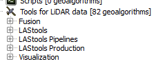
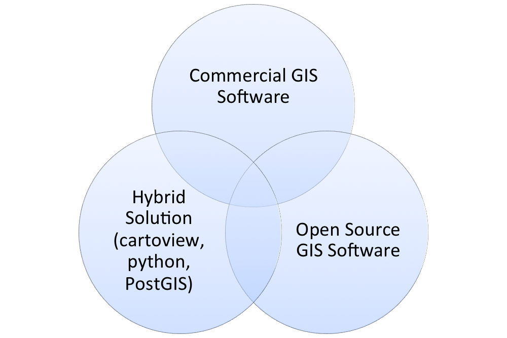
Happy holidays! I am certainly thankful for QGIS this year as it showed significant improvements to its capabilities and the user experience.  Many other free and open source GIS projects also improved including a major update of GRASS GIS and gvSIG graduating from incubation. In addition, SaTScan continues to get easier to use while providing advanced spatio-temporal statistics. GeoDA has reached nearly 150,000 downloads, and LAStools continues to rock!

Thanks to QGIS and  ALL FOSS GIS Developers!
I wanted to take a moment to talk about my QGIS wishlist for 2016.  In the coming year, I hope to get more involved...I am aiming for trying to create some plugins. You can checkout the QGIS roadmap and submit requests for new features at: http://hub.qgis.org/projects/quantum-gis/roadmap.

What are your wishes for QGIS in 2016?  Feel free to leave them in comment section below!

Of course, the core QGIS developers are always hard at work, and some of these may not be scheduled for the near or future release, but it is always good to dream! These are on the advanced feature end, and although not critical, would be nice to have.

My QGIS wishlist for 2016:
  • Continued commitment to cartography (definitely happening)
  • Full-funding goals reached for crowdsourced QGIS plugins and projects.
  • More maps in the QGIS Flickr Showcase (Do your part!)
  • Continued improvements to the Print Composer
  • Error-free or near-error free releases of QGIS. 
    • I worry as more features are added, more bugs could creep in!
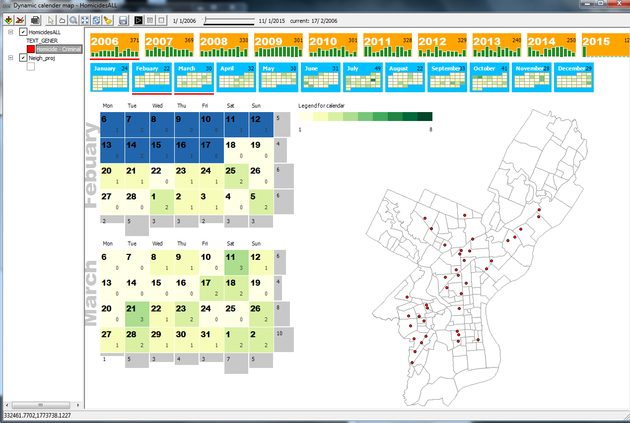
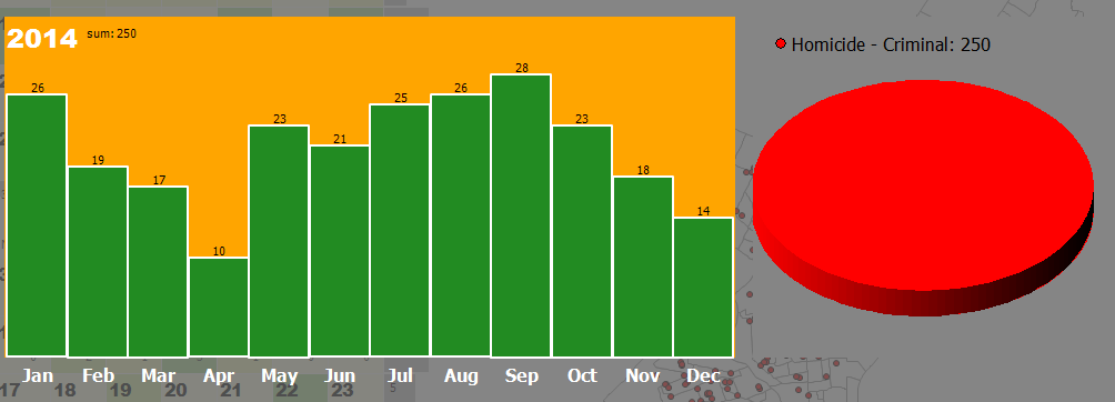
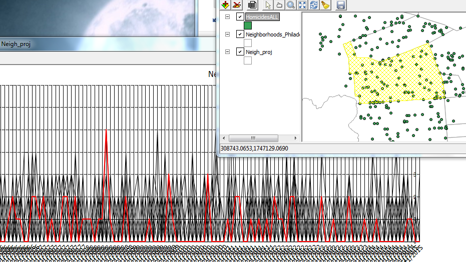
  • Ability to join points to lines - visualizing data by street segments can be extremely cool!
  • More spatial analysis tools integrated directly into QGIS core
    • Might include linear directional mean, standard distance, or others...
  • Ability to create an address locator from reference data
    • Online locators have limitations (number of records that can be (batch) geocoded) and can't be used for confidential data
Some other/non-QGIS wishes
How to contribute
Lastly, there are many ways to contribute to QGIS: http://qgis.org/en/site/getinvolved/index.html. Also, if you use QGIS, whether for school, business, government, or non-profit, please consider a donation!  https://www.qgis.org/en/site/getinvolved/donations.html

Monday, November 2, 2015

QGIS 2.12 Release: Focus on Customization

QGIS 2.12 Lyon has been released and focuses on customization based on user preferences and improvements for more efficient workflows.  For a quick overview of changes head over to the Visual Change Log:http://www.qgis.org/en/site/forusers/visualchangelog212/index.html

Project Management
After installing 2.12 and creating or re-saving at least one project, restart QGIS and you will be greeted by a "Recent Projects" window within QGIS that has a thumbnail of your project, title, and a few details, like coordinate system and projection.  Double-click on an entry and you will be taken to your project.

Recent Projects display nicely and neatly within QGIS.

User Interface
You can now change the color scheme of QGIS to suit your liking, daytime, or nighttime mapping lifestyle.  I am sure that the QGIS Community will come up with some neat themes--and at least one in QGIS green!  Note: As of writing, there has been a bug that will be quickly fixed.  How to make changes are described by the feature's creator here: http://nathanw.net/2015/08/29/ui-theme-support-now-core-in-qgis/.  The default UI can be rather bright being both gray and white.  Having some contrast can definitely help users in certain settings.

You can now change the UI theme to suit your liking.
Image source: http://nathanw.net/2015/08/29/ui-theme-support-now-core-in-qgis/

Conditional Formatting in the Attribute Table
Cells in attribute tables can now be color coded based on rules.  This can help to identify certain groups of data as well help to highlight errors or outliers. It is easy to overlook the new button for this feature. After opening the attribute table, look in the upper right-hand corner for a small button with color bars stacked. Click the image below to get a closer look at its placement.
In the table above, records for Alabama ("STATE"='AL') are highlighted in Red,
while Arizona's records below are not highlighted.
The color formats are saved, so when you re-open your QGIS project and the attribute table they will still be there.  It is a good way to keep notes or tag certain records for later.

Labels
There are numerous improvements to labeling including:
  • Only drawing labels that fit inside polygons
  • Label priority and obstacles
  • Rule-based labeling
Print composer
QGIS Atlas in Print Composer is getting closer and closer to ArcGIS's Data Driven Pages that is used to create map books.  Navigation is now easier as buttons allow users to skip ahead to any page in the map book. More data defined controls have been added -- allowing for the creation of more complex map books that loop over different layers.  If you want to learn more about the Atlas feature in QGIS, check out my YouTube video here: https://www.youtube.com/watch?v=gCISvTfHtZc

Symbology
Existing color ramps can now be edited, so you do not have to start from scratch.  This is a definite time-saver and an overdue feature.

All color ramps, including existing ones, can now be edited.

Other Notable New Features
There are improvements to digitizing in QGIS as well as raster alignment tools, and much more!

Thursday, October 22, 2015

Book Review: An Introduction to R for Spatial Analysis and Mapping

I decided to talk a walk on the wild-side and examined R as a GIS for spatial analysis.  I hope to use several of R's spatial statistics packages and to automate tasks--staying within one program.  I highly recommend Brunsdon and Comber's book ($50 on Amazon, Paperback, electronic versions also available).

About the Authors: Chris Brunsdon is the creator of geographically weighted regression or GWR. Lex Comber is a professor at Leeds University.

Four Reasons to choose R as a GIS
1)  You are interested in performing tailored exploratory spatial data analysis (ESDA), spatial statistics, regression analysis, and diagnostics.
  • Of course, R is also way better than ArcGIS and QGIS for summary statistics too. (Notably, QGIS has integrated a R processing toolbox into it. ArcGIS  also has an official bridge to R.)
2)  You already use R for non-spatial data, have lots of code written, and need to analyze spatial data.

3)  You do not want to export your data (or results) from one program into another and back again!

4) You want to be able to publish or share your code with a wider audience.

A great cover to a great book!
Reader Accessibility
The content is extremely well-presented, clear and concise, and includes color graphics. It is not overly technical. Still, R as a GIS and spatial analysis are tough material and is definitely not for the faint-of-heart. The authors assume readers may not have either a R or GIS background, or both. I took a R class in graduate school and occasionally use it.

Additional packages that assist in manipulating and reshaping data, such as plyr, are also discussed. The authors also warn readers that R packages can change over time, causing error messages, but many warn users about recent and upcoming changes.

Overview
In the first 40 pages, you will learn R basics, if you don't already have a foundation. Next, you will learn GIS fundamentals, how to plot data to create a map, taking into account scale, and adding and positioning common map elements like a north arrow and scale bar. This may sound basic but in R nothing is easy!  Of course, the advantage with code is that you can reuse it or may only need to modify it slightly for many maps.

Late in Chapter 5-6 the book dives into spatial analysis.  The last few chapters are probably the best of the book, as more advanced statistical techniques are discussed including local indicators of spatial auto correlation (LISAs), geographically weighted summary statistics and regression.

The book providers a great guide and reference, and I am sure I will be re-visiting it frequently!  Overall, it is a great mix of practice and theory.

Disclosures: 
None, I found and purchased the book on my own.

Wednesday, October 14, 2015

Video: QGIS Print Composer - Side-by-Side Maps and Atlas

QGIS has a powerful print composer that allows users to create complex maps very quickly.  Two common practical examples include creating: 1) side-by-side (or multiple maps) on the same canvas/layout and 2) a map book or atlas. This week's video looks at these cases: https://www.youtube.com/watch?v=gCISvTfHtZc.


In the video, we will create side-by-side maps of different band combinations of remote sensing imagery of the Salton Sea.  For a related blog post, visit:
http://opensourcegisblog.blogspot.com/2015/08/tutorial-side-by-side-maps-in-qgis.html

We will also use the atlas to take a closer look a battleground states during the 2012 presidential election.

Lastly, I searched high and low, but I could not find any guidance or cartographic reference on creating side-by-side maps. So, I looked through several dozen examples, found a couple of themes, and drafted some suggestions --which you can find towards the introduction--and below.
A few suggestions for creating multiple maps on the same canvas/layout.
In the coming months, we will also re-visit the atlas function in print composer and look at more complex examples.

Sunday, October 4, 2015

Video: Tips for Using QGIS Print Composer

QGIS Print Composer can be a little awkward to use at first.  It is analogous to Layout View in ArcGIS.  We will look at some tips to make it easier to use and understand how to create maps in QGIS.


In the video, we will review a map of 2012 Presidential Election Results, as seen below.


In Part II, I will show you how to create side-by-side map series, which is great to look at changes over time as well as different band combinations in remote sensing.  We will also take a look at creating an atlas or map book, essentially iterating/repeating the map making process by a geographic area.  Lastly, we will take a look at the QGIS Map Showcase on Flickr.

If there is something you would like to see, let me know in the comments section below.

Update #1: Print composer has an add Legend button but in this video I used an image file because I used some fancy rule-based symbology, the legend was not easy to look at. Normally, I would just select add Legend.

Wednesday, September 23, 2015

Video: Free and Open Source GIS Reference Data

After last week's post looking at the landscape of free and open source GIS software, the next logical step is looking at open GIS data. This video looks at reference data. I am still deciding on what to do the next video on...the choices are a) Open data portals, b) novel data types, social media (TwitteR and Instagram), or c) remote sensing.  Let me know what you would like to see in the comments below.


Topics covered in the video include:
Census: https://www.census.gov/geo/maps-data/data/tiger.html
DataFerrett: http://dataferrett.census.gov/
Summary File 1 DVD: https://www.census.gov/mp/www/cat/decennial_census_2010/summary_file_1_1.html
Natural Earth: http://www.naturalearthdata.com/
OpenStreetMap: https://www.openstreetmap.org/
GeoNames: http://www.geonames.org/
US Board on Geographic Names:http://geonames.usgs.gov/domestic/index.html
Maryland Department of Planning/ACS: http://www.mdp.state.md.us/msdc/S7_ACS.shtml

Tuesday, September 15, 2015

Video: A Quick Introduction to Free and Open Source GIS

My first video has been posted to YouTube.  It briefly covers the landscape of free and open source GIS (FOSS GIS), remote sensing and processing, a few related tools, and JavaScript libraries for creating online interactive webmaps.  It does not cover every program out there but gives new and returning users a place to see all of the options available.  You can check it out here: https://www.youtube.com/watch?v=rB_qnTE-W9c or subscribe to the channel by clicking here.

I hope to bring out more videos in the near future including delving into each of the programs and step-by-step tutorials.  So stay tuned!  As always feel free to leave comments, questions, or feedback below.  Be sure to like the video and subscribe if you would like to see more.

Thursday, September 3, 2015

Tips for Using LIDAR and LAStools in QGIS

LIDAR is an important technology that is undergoing continuous and expansive growth and predicted to reach $1 billion by 2020.  A recent report also describes ongoing developments in LIDAR in Europe. NOAA has a great one-hour Introduction to LIDAR that I recommend checking out: http://coast.noaa.gov/digitalcoast/training/intro-lidar

Source: Allied Market Research, https://www.alliedmarketresearch.com/lidar-market
LAStools is the popular LIDAR processing tool created by the developer of *.las and compressed *.laz formats.  There is a standalone program as well as toolboxes for a variety of programs including QGIS. We will cover a few tips and wrap up with a look at Wizard Island, Crater Lake, Oregon.

Linking LAStools with QGIS
Linking the two has gotten much simpler since QGIS 2.4.  Simply download the *.zip file from: http://lastools.org/download/lastools.zip.  Unzip the file, and copy and past the LAStools folder into a simple directory like "c:/" If you have QGIS running, close it before proceeding.

Tip #1: Users often copy the folder to a folder pathway that is complex and includes spaces like c:/Program Files/ or c:/My Documents. It will not work. Again, use simple path names, no spaces!

Tip #2: This also applies for any files you import with LAStools or export during processing in QGIS.

After doing this, start QGIS, go to the Processing Toolbar, click "Tools for LiDAR Data"->Activate-> and enter or browse to the folder pathway. I've been using LAStools with the most recent version of QGIS (2.10) and have not had any problems yet.

Linking LAStools and QGIS has gotten much easier!
Click "Ok", then head over to the Processing Toolbox side-panel, and you will see the tools ready-to-use!

Expand and see a wide range of tools at your disposal!
Note: The LAStools Production or PRO tools are for batch processing.

Tip #3: If you run a tool and nothing happens, be sure that NONE of the folder pathways, for importing data and exporting results, are complex and/or contain spaces.

Tip #4: Be sure to read the "Log" for important information and troubleshooting.


Tip #5:  When using lasview in QGIS, pressing Space bar changes your ability to navigate from zoom, tilt,pan, and translate.  In the upper-left of the window, you will see the navigation type change as you press it.

Furthermore, right-clicking the mouse, brings up a menu for changing the view of LIDAR, from selecting returns, how to symbolize/color data.

The right click menu in LAStools

Tip #6: To get a 3D view, press Space bar until Pan is displayed, if is not already.  Click and hold your mouse, then move it up to the top of the screen and voila!


Wizard Island, Crater Lake, Oregon, Data from: Open Topography. lasnoise was also used.
See also:
OpenTopography
Digital Coast
3D Elevation Program
Google search for "County lidar" and State LIDAR

Saturday, August 1, 2015

Tutorial: Side-by-Side Maps in QGIS Print Composer

Step #1: Open New Print Composer
QGIS print composer can be a bit daunting and confusing. It is equivalent to the Layout View in ArcGIS, where users can setup their map for printing and publication. One common task is to create side-by-side maps, to compare imagery, choropleth, or other types of maps.  I looked but could not find a good tutorial with screenshots, so here we go!


Purpose
To create three side-by-side maps of different band combinations from Landsat 7 imagery of the Salton Sea. The maps will be exactly the same size.  The different band combinations were created using the Orfeo Toolbox->Image Manipulation->Images Concatenation and selecting various band combinations.

Step #1:  For starters...
I've started by just selecting the natural color view (bands 3-2-1).  Go to the the Project Toolbar in the upper left-> New Print Composer. 

  • You can also can the page layout to landscape or portrait, depending on whether your map series will be laid out horizontally or vertically.

Step #2:  Creating the first map

Click the "Add New Map" button, highlighted in red. and draw an area for your map on the blank page.  For best fit of your image, be sure in QGIS to have zoomed into an area of interest. 


  • Then on the right hand side of print composer, select "Item Properties" and click the long button for "Set to Map Canvas."
After Steps #1-2

Step #3: Add the second map

Before adding the second map to the right, scroll up in "Item properties" and check the box for "Lock layers for map item."  The click on the existing map in print composer and copy and paste it. On this second map, be sure to uncheck the box we just checked: Uncheck "Lock layers for map item."


  • In QGIS, add the next layer, in this case I added a false color image from bands 4-3-2.
  • Go back into Print Composer and hit the blue refresh button.
  • The second map should display the false color image and the first map should remain natural color.
After Step #3

Step #4: Repeat for the third map
Before copying and pasting, make sure to check the "Lock layers for map item" box.  Copy, paste, and then uncheck this for the third map, with the last set of band combinations (7-4-2).  The final map appears below.
Click to enlarge the map.
Three side-by-side maps, equal sized, and the same scale.
For more information:
You can find additional tips about using the map composer from multiple frames and different layers in this discussion on StackExchange: http://gis.stackexchange.com/questions/45174/how-to-handle-multiple-map-frames-with-different-layers-in-one-print-layout

Wednesday, July 8, 2015

What to Expect in QGIS 2.10 Pisa

With the next release of QGIS on the horizon, I downloaded the latest nightly build and looked through the visual change log to see what to expect.  What I found is very exciting!

If you have not looked at QGIS Visual Change Log, it is a quick way to see changes from release-to-release.  It includes screenshots and quick explanations of the upcoming changes.  It also lists the contributor(s) and funding source.

Rasters
The new release includes log functions (natural and base 10) for the raster calculator.  This is great since many remote sensing calculations use logs, for example land surface temperature via Landsat 8. Zonal Statistics for rasters is now included as a core plugin of QGIS.  This allows users to summarize the characteristics of raster layers using a polygon layer for setting zones.

Symbology and Histograms
When you go to symbolize a layer using a graduated scheme, you can now adjust the breaks by using an interactive histogram, akin to what you will find in ArcGIS.  If you change your classification scheme, be sure to (re)load or reclassify the layer before clicking on the histogram tab.  Below is quick example using population by county for Maryland.

Histogram view of two classification schemes:
Top: Equal interval, Bottom: Quantile / Equal Count
Live layer effects
Live layer effects is probably the most talked about new feature and was crowd-sourced.  It adds the ability for a variety of effects including a drop shadow.  The creator of this feature has a great post and quick how-to. Basically, when you got to style a layer, look towards the bottom, check the "Draw Effects" check-box.  Then, look a fair way to your right and click the 'yellow star.'

I found using this to be much easier-to-use than its implementation in ArcGIS.

It can be easy to overlook the Draw Effects check box when styling.
Adding effects is easy-to-do in QGIS and look good!
Often, I feel my maps can get stale, or someone wants a more 'graphic' or photo-shopped look for a presentation, other product, or to develop a 'brand.' So having this feature is great, especially, if like me, you are not an expert graphic designer or cartographer. I look forward to seeing creative uses of this feature in the QGIS Flickr Map Showcase.  There may already be a few in there!

Follow point labeling
Good, clear, and legible labeling help separate the good mappers from the bad.  Follow point labeling has been added to align text based on where the label is located.  So, if a label appears to the left of a point, the text will be right-aligned.  This will also help with multi-line labels.

True Curves
There is a new geometry engine which allows for 'true curves' to be represented as such -- instead of segmented lines or polygons.  If I am not mistaken, I believe this is very important for a variety of users, but particularly for CAD users or those that use CAD and GIS.

New desktop icon
To start QGIS, the old familiar neon yellow/green "Q" is gone in favor of a more professional looking two-tone green globe for an icon.  I am glad that the distinctive QGIS green remains,  For those using both ArcGIS and QGIS installed on the same computer, it will still be easy to distinguish between the program icons.

Monday, June 29, 2015

Book Review: PostGIS Essentials

I decided to teach myself PostGIS/PostgreSQL.  The other option was returning to GeoServer, which I started last summer, but I will leave the latter for the fall.

After shopping around and reading reader reviews, I purchased PostGIS Essentials, April 2015 by Angel Marquez. I got a Kindle copy which was $22 on Amazon.  Overall, I recommend it for those, like me, who want to learn PostGIS as a beginner. Having even a little SQL knowledge is also very helpful.  However, the later chapters are for much more advanced users and developing web and desktop applications.

The book covers downloading and installing PostGIS and gives a good quick background on its uses. Next, it illustrates three ways to create a spatial database using: 1) the command prompt, 2) the toolbars or GUI in PostGIS, and 3) a SQL script.  

A great way to learn PostGIS/PostgreSQL
Before covering how to insert data into these tables, the book goes into discussion of projections and how to include these in spatial tables.  It then shows how to manually add this information and also extract it from shapefiles and import it into PostGIS.

Next, we get down to business with creating non-spatial and spatial queries/functions and accessing information from more than one database.  Of course, connecting to PostGIS databases in QGIS is also covered as well as doing spatial queries in QGIS using PostGIS using DB Manager toolbar in QGIS.

Going from PostGIS to QGIS is a snap!
Using DB Manager from the database toolbar in QGIS.

You will also find information on GDAL, working with raster files.  The last few chapters cover advanced features including performance tuning and spatial indexes, developing web and desktop GIS applications.  The latter uses NASA World Wind.  (Note: I have only had time to skim these chapters.)

A few quick pointers

  • Early on the book assumes the reader knows where to execute SQL queries..If you are a novice like me it takes a minute to realize it is the magnifying glass 
  • ...and how to switch to a different database table when running code on several different ones. 

  • Be sure to check the column names in data from OpenStreetMap, particularly the id column: osm_id vs. id.
Overall, the book is a great resource to have. Like all of Packt's books the code is available to download on their website, or you can type it in yourself, which is my preference.

Disclosures
I bought the copy of this book on my own.  I served as a reviewer for another Packt publication.

Tuesday, June 16, 2015

QGIS vs. ArcGIS: Adding Magnetic Declination

This is a QGIS vs. ArcGIS throwdown.  It has been a while since I did the last one on kernel density and Thiessen polygons.  Recently, I was looking over new QGIS plugins and one in particular caught my eye: the QGIS Magnetic Declination Plugin. Magnetic declination is simply the difference between geographic and magnetic north, caused by the earth's magnetic fields. This difference also changes over time. ESRI has a nice technical article on their blog.

NOAA Historical Magnetic Declination Viewer:
http://maps.ngdc.noaa.gov/viewers/historical_declination/
ArcGIS
Adding a declination diagram in ArcGIS can be a bit tricky. As of version 10.2, there is a template and several tools to assist.  You will need a Standard or Advanced license plus the Production Mapping Extension.

QGIS Plugin
On main toolbar in QGIS, go to Plugins-->Manage and Install Plugins--> and search for Magnetic Declination. After a quick installation, you will see a green and yellow star appear on your toolbar. Click it and you will see the toolbar open below.

You can select a location off a map, such as OpenStreetMap, calculate it and map it!  Best of all, the resulting compass rose and measurements also appear in QGIS Print Composer.  Under the options tab, you can also change the color. I found it helpful to change it to black.

Steps:
  1. Click LON/LAT from map
  2. Choose any options
  3. Press "Calculate" button
  4. Then "Draw Compass Rose"
Screenshot of the plugin, steps, and buttons.

  • Click any of the screenshots below to get a closer look.
Up close example with  declination, true, and magnetic north shown in Greenland
where declination is much greater.
Showing positive, zero, and negative declination in the US.

The plugin is very new but is being updated, so stay tuned!

Update #1
I forgot to mention that you can customize the size/diameter of the compass rose--as large or as small as you need depending on whether you are interested adding it to a small scale map or a large scale map.

Monday, March 30, 2015

FOSS GIS Version Checks - March 2015

Keeping software up-to-date is extremely important. Free and open source (FOSS) GIS software are no exception.  Typically, updates bring fixes, better stability, sometimes performance improvements or security patches, and even new features, some of which can be game changers!  Keep an eye on FOSS GIS websites or subscribe to their e-mail listserves to keep up-to-date.

Here's a quick list of a few free and open source GIS programs, related software packages and libraries, and their version numbers.

Desktop GIS
GRASS GIS 7.0.0 LTS
QGIS 2.8.1 Wien LTR
OpenJump 1.8.0

Remote Sensing/Image Processing
Orfeo Toolbox 4.4
Opticks Image Processing 4.12.0

LIDAR
Fusion LIDAR 3.42
FugroViewer 2.0
LAStools (March 2015)

Spatial Analysis
GeoDA 1.6.7
GWR 4.0
SaTScan 9.4.1

Web map development
Leaflet 0.7.3 - an open source JavaScript library for mobile web maps
Open Layers 3.4
GeoServer 2.7.0

QGIS Visual Changelog makes learning about new features a breeze!
Many open source GIS programs have a roadmap, 'wiki', or version log. These exhaustive sources of information can give you the heads-up on when an update will be released and what features the new version may contain.  They also contain lists of bugs, potential fixes, and the progress toward the fix.

Lastly, updates for paid software are also important and sometimes may require you to update your license agreement, depending on when you purchased the software. Additional fees may apply.

Monday, March 16, 2015

Businesses Based on Open Source GIS

Businesses based on free and open source GIS software (FOSS GIS) offer a number of opportunities to owners and clients alike.  Like Red Hat and Linux, these companies offer several services using FOSS GIS.  At least two have their own suite or development tools (Boundless OpenGeo Suite and Cartologic's Cartoview).  These services include: consulting, development, training (sometimes certification/testing), and support.

Of course, these businesses also offer job opportunities 
for those interested in FOSS GIS! 

In today's post, we will look at a sample of companies out there, where they are based, their philosophy, and specific areas of interest.  All businesses that I reviewed offer sample or demo web maps and apps on their websites.  Although the companies are based around the world, they all offer services to clients whether near or far.

New York-based Boundless is the biggest company out there with 45 employees and venture capital financing.  It has its own suite of software OpenGeo Suite and emphasizes interoperability of different combinations of open and paid-software.  Boundless has a big list of big name clients across different sectors.


This same philosophy that GIS tools can come from different realms is also shared by Cartologic based on Giza, Egypt.  They are a team of geospatial IT developers and focus on Business Integration, GIS Mobile Applications, and GeoPortals.  Cartologic offers the free Cartoview an open source web platform for publishing maps.  (I will cover Cartoview in a later post.)

Many businesses recognize that a client's needs
can be met in more than one way, as this diagram
from Cartologic illustrates.
South Africa-based Kartoza was formed as a merger between Linfiniti Consulting (Tim Sutton) and Afrispatial in 2014. Kartoza's key business areas are: Training and Education, Deployment and Support, and Software Development. Kartoza is also a Boundless partner for Southern Africa.

The UK-based Lutra Consulting specializes in flood risk.  Like many of these, businesses, they have given back to the open source community--especially through the creation of QGIS plugins, like AutoTrace.  They are currently crowd funding for AutoTrace 2.

gvSIG Association (SIG is Spanish for GIS or un sistema de informacion geografica).  gvSIG moved from a DOT.org to a DOT.com.  It is located in Valencia, Spain and  is based off of the free desktop and mobile platforms of gvSIG.

The Association raises a new business model around Free Software democratic values, 
based on cooperation and shared knowledge, where part of the generated benefit 
reverts on the strengthening of the gvSIG project. 

NaturalGIS, based in Evora, Portugal, utilizes QGIS and PostGIS/PostgreSQL features services including:  Consulting, Web Development, Training, Data Analysis, Support, and Development.

Many businesses, like NaturalGIS, use QGIS as the go-to replacement for ArcGIS.
Businesses that offer commercial support for QGIS:
http://www2.qgis.org/en/site/forusers/commercial_support.html

Contact me
If you are a business based on open source GIS software, I want to hear more about you!  Please leave a link and a little about you in the comment section below.  I am thinking about compiling a list of different companies.

Sunday, March 8, 2015

Spatial Analysis with QGIS - Part I: Point Data

QGIS 2.8 Wien was released, so it is a good time to review QGIS's basic spatial analysis capabilities for vector data--starting with point data. We will also take a look at a few plugins and the SAGA and R processing toolboxes. Most of the functionality in QGIS is from Ftools, formerly a plugin, now part of base QGIS. There is also the MMQGIS plugin to examine vector data.

In addition, I will make a few recommendations for added features, or point you to another free or open source program that can be used in conjunction with QGIS or simply by importing and exporting data.

Nearest Neighbor Index
QGIS can calculate the nearest neighbor index to assess point clustering.  No p-value is given but the simple trick is to remember that large negative z-scores mean the points are clustered while large positive z-scores mean the data is more dispersed.
No p-values are given but remembering critical values/decision points,i.e. +/-1.65, 1.96,
is the easiest way to know if clustering is statistically significant.
Mean Center and Standard Distance
The mean center, an average of x- and y- coordinates, is an easy way to find the central feature and to examine spatial-temporal trends.  In the case below, the mean of all starting points, by year, for US tornadoes, 2000-2013. The data are grouped by UID, in this case a year variable.  It would be great to also be able to calculate a median center.  Data source: NOAA Storm Prediction Center.
  • In some years, the average was pulled slightly west or east.  Interestingly, the mean is pulled east in 2011, when there was a large 'outbreak' of tornadoes across the southeastern US.

The mean of all 'starting' points for US tornadoes, by year, 2000-2013.
Moreover, there are several point pattern analysis tools, including the standard distance--a measure of dispersion--in the SAGA Processing Toolbox.  More specifically the "Geostatistics" tool, contains a lot of useful functions that can be used.  The output can be  saved and displayed in QGIS.  The NOAA dataset already contains the length from start to end, but you could also calculate this by creating a distance matrix in QGIS.


The SAGA Geostatistics Toolbox in QGIS
Ripley's K
Ripley's K helps to determine clustering at different distances.  It can be implemented through the R processing toolbox in QGIS, using R's SpatStat package, or CrimeStat.

Heatmap
You can download the Heatmap plugin or use a built-in live/dynamic heat map when you go to style a layer.  For the latter, make sure to move the rendering slider to 'best' for a nice looking heatmap. Here is an example using the dynamic heat map to look at homicides in Philadelphia. Data source: OpenDataPhilly.   In future posts, we will also look at alternatives to heatmaps, like gridding/quadrat analysis.

QGIS has lot of neat options for styling vector data, including a dynamic heatmap
that changes as you zoom in and out.
 (Note: In ArcGIS kernel density tool (not to be confused with point density) remains separate from the base software and has to be purchased through the Spatial Analyst Extension).

Grouping Analysis
Lastly, grouping analysis can be examined using PostGIS, which allows for a wide variety of spatial queries using SQL, or CrimeStat.

Near future...
We will look at spatial analysis of line and polygon data as well joining points for analysis.

GME and ArcGIS
When using ArcGIS, be sure to check out the free windows-based program Geospatial Modelling Environment, or GME formerly 'Hawth's Tools," http://www.spatialecology.com/gme/.  GME has a long list of helpeful commands: http://www.spatialecology.com/gme/gmecommands.htm.

Sunday, February 1, 2015

Crime Analytics for Space-Time (CAST)

Crime Analytics for Space-Time (CAST) - alpha (2013) is a free and open-source cross-platform program (Windows, Mac OSX and Linux) designed "to detect spatial patterns and trends in crime data."

CAST is a nifty piece of software that combines key functions of other programs from the ASU GeoDA Center with a greater emphasis on temporal trends.  It even allows you to view data by calendar days, months, and years.

What you will need...
All you need is a shapefile of projected crime incident data and any boundary files (posts, census tracts, blocks, etc.).  To perform some types of cluster analysis, you will also need to aggregate your data.  If all you have is a *.csv, you can use QGIS to crate a shapefile file and save it for importing into CAST. There is sample data from San Francisco available here.

Check the format of your date field
If you are having trouble with using your data's date fields in CAST, use QGIS's field calculator to create a new variable with an output field type of "Date." Next, use "Conversions" and "to date" under the function list, and make sure the variable you enter is in the format "YYYY-MM-DD".  So, the expression should read:  todate( "Date Field" )
  • Make sure to create separate fields for date and time--rather than one single field. 
  • I tried a couple different formats but this format worked. 
  • In CAST, you will be able to select your date field. 
CAST can do a lot!
In the "Tools" menu, you can create a grid and save it as a shapefile.  Under "Table", you can view attribute data for your shapefile. The "Weights" menu allows you to create spatial weights and view a connectivity histogram, like in GeoDA.  The "Map" menu allows you to symbolize polygons by several different criteria.  The real fun comes in the last four menus: Calendar Map, Cluster Map, Time, and Explore.

Calendar Map + Dynamic Map
One of CAST's interesting features is combing a calendar with the number of events and a map.  You can add shapefiles and layer them, although a bit tricky by clicking on each. Below are few examples using homicide data from Open Data Philly.


A calendar and map of homicides in Philadelphia starting in 2006.
Clicking a calendar will bring up a bar and pie graph (which can show a
breakdown if there is more than one category of crime/event in your data).
Graphs and maps are linked in CAST, so clicking on a feature or peak in a graph will highlight the selected features.
Like other ASU software, all graphs and maps are linked. Here one line was selected,
which represents one neighborhood, and the corresponding area on the map is highlighted.
Cluster Map
You will find a lot of tasks that are identical to GeoDA here plus some dynamic density maps.

Time & Explore
Trend graphs area available here as well as standard graphs like a histogram, scatterplot, and boxplots.

In sum...
Looking at patterns over space and time is difficult, but CAST can help.  Unfortunately, you cannot save a session in CAST so be sure to keep track of what steps you perform.  Limit your data to the time period of interest. I would not recommend adding huge point shapefiles.  Lastly, I was not able to save a movie/*.gif of animations over time, but if I figure it out, I will update this post.

For more information:
CAST Manual

Sunday, January 25, 2015

Free Five Course Series on QGIS Starts Soon

Del Mar College is offering a free online course that gives an introduction to GIS and QGIS.  The course is titled "Introduction to Geospatial Technology Using QGIS" and is available from the Canvas Network.  The five-week course is self-paced and runs from February 23rd to March 27th. Already 1,000 students are signed up. The courses were created with funds from the National Science Foundation (NSF) and US Department of Labor.

It is great to see a course geared towards QGIS!  The course hits on components of the core competencies for entry level geospatial occupations as outlined here.  It includes lectures and hands-on exercises.  If you can't wait or can't find time, the course materials for this course and others are available at GitHub: https://github.com/FOSS4GAcademy.

From the OSGeo listserve, this course is part of a larger effort to educate about GIS and FOSS GIS called "Geo For All" and GeoAcademy.  This is the first course in a sequence of five, so more courses will be on the way!

The other four courses are:
  • Spatial Analysis Using QGIS
  • Data Acquisition and Management Using QGIS
  • Cartography Using QGIS
  • Remote Sensing Using QGIS
If you know someone who is interested in GIS or QGIS and likes independent study, it looks like a solid opportunity!  
For more information: https://www.canvas.net/browse/delmarcollege/courses/cn-1681-intro-qgis

Course offerings from Penn State University (PSU) and Coursera: 
http://opensourcegisblog.blogspot.com/2014/08/free-online-mapping-classes-from-psu.html

Wednesday, January 7, 2015

FGBASE: Fast Grid-Based Spatial Data Mining

FGBASE is a new open source software for using scan statistics on gridded data.  Unlike SaTScan, FGBASE only currently runs on Mac OS X (10.6, 10.7, and 10.8) instead of Windows and also allows for its source code to be downloaded here: http://www.fgbase.org/download-fgbase/.  The software was specifically created for environmental epidemiology but has potential applications to any fields of study concerned with finding clusters.

Analyzing aggregate data, using either software package, helps to speed up computationally intensive equations for finding spatial, temporal, or spatiotemporal clusters.

Comparison of FGBASE and SaTScan


FGBASE
SaTScan
Operating system(s)
Mac OS X
Windows, Linux,
Mac OS X
Open source code
Yes
No
Geographic output
In app
New: Export to KML or SHP
Sample data sets
Yes, 1
Yes, several
Documentation
TBD
Extensive
Publications
1
Extensive, hundreds
           
Although FGBASE comes with some sample data (available at: http://www.fgbase.org/user-data/), the program was only recently released.  Aside: The data set is different from the one used in the published paper, so you will notice differences when looking at your screen.  What data sets you will need and how they are structured is available at: http://www.fgbase.org/user-data/.

Clusters can be examined using a data-driven approach answering the question: where are the clusters?  Or, a hypothesis-driven approach can be used: are there clusters relative to a source(s) of exposure, where entities (factories,etc.) may be responsible for the clustering of cases.

A stock screenshot of FGBASE. Source: IJHG
I downloaded and installed FGBASE.  I will check back in with more impressions in a few months. Adding documentation, with a tutorial, or even a short YouTube video could greatly aid users.  I also plan to blog about getting data into SatScan and interpreting results later in the year.  Since FGBASE's source code is public, hopefully this will speed further development of the program and aid troubleshooting.

Read more at the International Journal of Health Geographics:
http://www.ij-healthgeographics.com/content/pdf/1476-072X-13-46.pdf

See also:
Treescan
R: Spatial Epi Package
There is also an experimental SaTSViz plugin in QGIS but I have not had a chance to look at.