Sunday, December 1, 2013

Book Review: Learning QGIS 2.0

The best place to discover QGIS is "Learning QGIS 2.0" by Anita Graser for its brevity and attention to detail.  Making great maps using QGIS, a free and open source desktop GIS, is only a few steps away using this book.  Released in September 2013, it is the most up-to-date reference on how to get the results you want using QGIS.  I finally had a chance to read the e-book in its entirety and here is what I think.

The book was written for a range of audiences--including newcomers and more seasoned veterans.  It covers basic and advanced topics from installing QGIS, whether a user or developer and  Ubuntu/Linux or Windows, to adding and editing map data.  In addition, the book contains color screenshots to illustrate what actions are being performed.

The book proceeds logically and words are used efficiently. It helps users add different types of GIS-related data, understand how QGIS treats projections, and highlights vital mapmaking tasks such as symbolizing and labeling.   It also covers QGIS' plugins, notably the Open Street Map plugin for using common basemaps and the Heatmap plugin for density analysis.

Later topics include using the Map Composer (analogous to Layout View in ArcGIS) and the Graphical modeler (Model Builder in ArcGIS). 

Two potential criticisms of open source software are that they tend be harder to use than their paid counterparts.  In addition, some programs lack easy-to-read and authoritative documentation.  With "Learning QGIS 2.0", these barriers no longer exist.   The timing of the book could not be more perfect with the release of QGIS 2.0 Dufour.

When you finish the book, be sure to visit Anita Graser's blog at: http://anitagraser.com/.  It is a real treat!  There you can gain even more advanced knowledge.

To purchase Learning QGIS 2.0 visit Packt Publishing or Amazon.com and Kindle.  The book is available both in e-book formats and physical paper copies/softcover.  E-book formats run about $12.  You can also get a physical copy of the book and all e-book formats for ~$25 on the publisher's site.  Released Sept 2013, 110 pages.

Available from Packt Publishing and Amazon/Amazon Kindle

Sunday, November 17, 2013

Fighting the MOOCDEMIC with Open Source GIS

The MOOCDEMIC, billed as the world's first online epidemic, is an web-based app that simulates infectious disease dynamics--part of a Coursera course.  Coursera courses are free massive open online courses. 

Moreover, the app is also GIS based and anyone can participate.  Participants "scan" for infection from their present position with a mobile device.  How cases are being seeded or created has not yet made been clear to participants.  So, stay tuned... The course creators also created a game called "Vax" showing differences between vaccination strategies.

The epidemic is about half-way over, at least in terms of course time, and here are a few physical and online maps that I have produced using QGIS and CartoDB. The course instructors have released a basic *.text file of date/times and coordinates for crowd sourced analysis.  CartoDB allows for beautiful maps to be created quickly, has CartoCSS elements, but does not require the expertise and time as other packages such as MapBox/TileMill.

What I chose and why:  I chose to use QGIS as my desktop GIS platform.  In addition, I chose Natural Earth for my base layers.  Using both, I knew that any of my tens of thousands classmates could duplicate my work for no cost.  Furthermore, they maintain accuracy worldwide but keep details to a minimum, so I could work with them quickly.  I did not need to be bogged down with huge layers or downloads. 

The physical maps are below and a link to one interactive map with cases can be found here:  http://cdb.io/17C1sKA.  Click on the maps below to enlarge them.


Week 1 Map: Early in the epidemic...

 
Hong Kong: Generated/fake "cases" appear to be located in
 the water through error or perhaps how they are being generated.


Wednesday, October 9, 2013

Quantum GIS 2.0 Dufour Released

This entry is out-of-date.  Please read: http://opensourcegisblog.blogspot.com/2014/07/qgis-24-chugiak-released.html

Quantum GIS or QGIS 2.0 has been released!  Be sure to check it out on the newly redesigned QGIS website: http://www.qgis.org/en/site/.
New Sleek Looking QGIS Website

The user interface has undergone some improvements aesthetically and functionally.  Several of the plugins appear to be working better--including the heat map add-on--for getting your spatial analysis started. The user can even choose the type of kernel function.  Symbolizing layers also has improved and appears to be easier.

A Heat/Density Map of Healthy Food Stores in Philadelphia
 For a full list of the new features, go here: http://www.qgis.org/en/docs/user_manual/preamble/whats_new.html

If you have not used QGIS before, be sure to check out the user's section: http://www.qgis.org/en/site/forusers/index.html

Lastly a new e-book and book in print has been published by a top QGIS blogger.  Be sure to check it out, even if you have some experience using QGIS before! http://www.packtpub.com/learning-qgis-2-0-to-create-maps-and-perform-geoprocessing-tasks/book

Trivia: Previous releases of QGIS have been named after places.  However, this release is named after a famous cartographer: http://en.wikipedia.org/wiki/Guillaume-Henri_Dufour

Open data combined with open source GIS is an extremely powerful and versatile platform!

Sunday, September 15, 2013

Cleaning Address Fields with R String Functions

I have been surprised by the lack of solutions for cleaning addresses in the open source world. So, I decided to look into R Statistical Program.  Whether in R or other statistical programs, both have string/character functions that allow for splitting fields.  The stringr R package is also very helpful.

Dirty address fields can be a symptom of problems with data collection (lack of defined fields, standardization, minor errors) or something simple--like  typographical errors -- which can be compounded over time. 

These mistakes can affect matching of addresses to reference datasets and ultimately any analysis that is performed. If addresses are so poorly collected, no analysis may actually be able to be done or simply have results that are two unreliable to interpret.

Before geocoding addresses, it is best to get the data as "clean" as possible.  If you have a database setup properly with data being entered by automation or by hand, validation rules, or warning messages about potential conflicts, then you should be in relatively good shape. 

Hopefully, in the coming weeks, I will have some sample data and R code posted illustrating common problems and solutions.


Monday, July 29, 2013

OpenLayers 3.0

OpenLayers is a great resource for those wanting to put a map on the web.  Simply put, OpenLayers "is a pure JavaScript library for displaying map data in most modern web browsers, with no server-side dependencies." Many posts ago, I used OpenLayers to post a web map.

New features will include a more accessible API and a host of other features.  An alpha version is currently available for download: https://github.com/openlayers/ol3/releases/tag/r3.0.0-alpha.4

If you have not seen OpenLayers libraries before be sure to check out: http://openlayers.org/.


Monday, July 8, 2013

AIDSVu Map Provides Better National View of the Epidemic

AIDSVu Map provides the "most detailed publicly available view of HIV prevalence in the United States"  It is a "compilation of interactive online maps that display HIV prevalence data at the national, state and local levels and by different demographics, including age, race and sex."

Estimates of the prevalence of persons living with HIV go from the state and county level down to ZIP codes and census tracts in the United States.  AIDSVu was produced by the Emory School of Public Health.  In addition, it provides aggregate data for download and use.  The website uses OpenStreetMap. Click either of the screenshots below to enlarge them.

An Overview of Several Cities


The Epidemic in Houston
In addition, the group does a good job explaining the methods for protecting patient privacy--avoiding cases where a person's identity may be surmised from sparse population, data, or a combination of circumstances.

However, it would be nice to see some spatial analysis doneor overlays with socioeconomic data to help the viewer understand patterns.  Overall, the map performs very well on the web.  Zooming-in is relatively straightforward and the map renders well--but is quite flicker-y.  Maybe a projection issue? It is good to see some agencies using census tracts over ZIP codes because of the ease to link them to Census and American Community Survey (ACS) Data.

Sunday, June 2, 2013

USGS Seamless ArcGIS Toolbar

Paid and free and open-source software (FOSS) and data do not have to work in isolation.  One example is the USGS ArcGIS Toolbar (for versions 9.3 and 10) that allows users to seamlessly download data from the USGS into ArcGIS. 

As stated on the USGS website:
"The purpose of the enhanced tools are to allow the user to define an area of interest (AOI), select products or options for downloading products, and then download the product to a local disk. The capabilities available in ArcMap would allow for more client options: add preview, index and outline layers, template selection, reprojection, and import the downloaded products into the current map overlay. All of this can be done without leaving the ArcMap environment. With the functions included with the ArcGIS toolbox, users may allow for client-side scripting, model-building, and easier integration in local ArcGIS based development." 

It beats hopping from different websites, waiting and moving downloads, checking your e-mail, and all of those other activities preventing you from getting work done!

Check it out here and give it a try!:  http://cumulus.cr.usgs.gov/toolbar.php

Tuesday, May 28, 2013

TileMill and MapBox

Publishing a map on the web can be accomplished through many different ways and programs.  Costs, ranging from free to expensive, are mostly based on the popularity of the map (i.e. number of views) as well as how much information is stored to create the map.  Performance of the map can also be a key component to cost.

MapBox, a website, and it associated downloadable tool, TileMill, are a great way to create a visually appealing, interactive, and quickly deployable map.  The fully interactive map is available here. The map below works correctly in Firefox.


A screenshot below shows the TileMill program with an example of easy coding on the right-hand side.  If you decide to give TileMill a try, be sure to check out its Crash Course!
Screenshot of TileMill

Saturday, May 18, 2013

Census Data: Easier to Use

The Census Bureau has come a long way by offering census data in formats that can be easily imported into GIS software.  Whether at small or large scales, census data are vital to any analysis.  Of course, census data are free, even though some companies charge!  In addition, it is noteworthy to add census data can be ordered on DVD and includes user friendly tools to help extract the data you need.

Previously, and in still in some cases, attribute data would have to be joined with shapefiles.  The TIGER/Line page now features demographic and social data pre-joined to shapefiles and geodatabases for users that are not familiar with joining and managing such complex data. Click the map below to enlarge it.

US Population Counts by County and Cities with Population Greater than 250,000

Data from the American Community Survey (ACS) 5-year estimates can also be downloaded easily.  However, more can be done and more ready-to-use files could be created--resources allowing!  Hopefully, the Census will be able to maintain what they are doing and expand in the future.

Family Size (Purple/Red = Greater than 1 Standard Deviation above the mean, Blue = Below, No Color = Mean to 1 SD Above).  Both maps are derived from data in the Summary Demographic Profile 1.

Maps made with QGIS

Sunday, May 5, 2013

Space-Time Cluster Analysis with SatScan

For more information: Visit the latest post on SatScan: http://opensourcegisblog.blogspot.com/2015/02/satscan-94-released-better-than-ever.html

Original post
Numerous basic and advanced techniques exist for finding spatial and temporal clusters.  Searching for clusters has broad applications for any field of scientific inquiry!

Unlike other spatial models in other free and paid software, SatScan's statistics' probability distributions allow for poisson (count data and rates) and binomial distributions--to name two.  There is also the ability to treat same data as continuous.  You won't find an easier way to do this than with SatScan!

SatScan is a free program but requires several steps to get data into it for analysis.  For most analyses you will need three files in a text delimited format -- without column headers (such as variable names).

The three files: 1)  A case file with a column for the geographic unit. day, month or year (see documentation), and number of cases.  You can aggregate the data into any geographic unit--large or small. 2) A geographic coordinate file (cartesian or lat/long) with the name of the unit (i.e. census tract), x and y for centroids of the geographic units, and 3) population file with the estimated population over the time period-- by year.

After this slightly painful process, which one learned, can easily be duplicated, one can easily perform complex spatial analysis and adjust key parameters such as the population at risk and maximum size of the cluster.  Time units are important, and you will have to make key decisions as to how long a cluster may have to develop--depending on the problem of interest.

SatScan can look for purely spatial, purely temporal, space-time, and spatial variation in temporal trends in data.   SatScan uses 'scan' statistics/scanning window and cylinder to finding and differentiating potential clusters.

SatScan's output includes *.txt and/or *.dbf files of the results and clusters.  The *.gis file can be joined to the shapefile of the geographic units, which are using, to show risks and different clusters.  This part is straightforward and less painful.  You will need to take your time selecting parameters and interepreting results!

Two good articles to read are: 1)  Block's Tutorial and Review   and 2) Visual Analytics of Space-Time Statistics.  The SatScan manual on its website also has a great list of references.

Additional Article:
http://medicine.plosjournals.org/archive/1549-1676/2/3/pdf/10.1371_journal.pmed.0020059-L.pdf

Tuesday, April 30, 2013

Files, Files Everywhere!

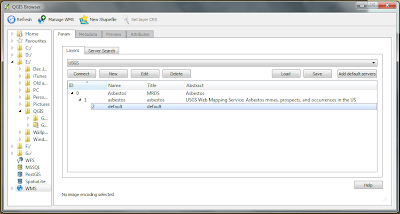
Naming, organizing, and accessing files during any type of analysis or project is always a challenge.  The most recent release of QGIS features a file browser to help create and manage different types of geospatial data and is akin to ArcCatalog.  After installing QGIS, you will notice a second yellow "Q" icon--this is the shortcut to the browser.

In the example below, you will see a connection made to USGS Web Map Service (WMS) through the QGIS browser.

Finally, a way to organize all of these open GIS files!

The browser can also be docked to QGIS so there is no need to re-open and close any windows.

Wednesday, April 17, 2013

Arches Heritage Inventory and Management System

For a more recent update on Arches 3.0, visit: http://opensourcegisblog.blogspot.com/2015/05/arches-30-released-for-heritage.html


If you have taken or even thought of taking an anthropology course, you will understand the need for Arches. Arches is an open-source based heritage inventory and management system.   It was envisioned and created by the Getty Conservation Institute (GCI).  Code is currently available for download. A more advanced version is expected in July. 
"Arches has been purpose-built for the international cultural heritage field, and can be used to inventory and document all types of immovable heritage, including buildings and other structures, cultural landscapes, heritage ensembles or districts, as well as archaeological sites."
On the Arches website, you will also find interesting background information about similar systems being deployed: http://archesproject.org/project-background/.  Also be sure to check about their FAQ page: http://archesproject.org/faq/ or view the factsheet.

For a quick hands-on-feel, quick out a demo from an earlier version of the tool using Jordan and search for a site like Petra and explore a few different areas.  You will notice familiar features, like web-based mapping from OpenLayers.


Wednesday, April 10, 2013

CrimeStat & GME vs. ArcGIS: Kernel Density

Many spatial analyses begin with using kernel density in GIS.  In ArcGIS, kernel density is part of the Spatial Analyst Extension.  However, several viable alternatives exist.  For today's post, I chose two of the easiest to implement and the ones that I have had the most success with: CrimeStat and Geospatial Modeling Environment (GME), formerly known as Hawth's Tools. Note: For GME you will also have to have R installed and several spatial packages.  They are both free, so enjoy!

When using these different tools, keep in mind that there are different kernel functions. ArcGIS uses a quadratic estimation while CrimeStat and GME have several. Click on the image below to magnify it.   The maps show density analysis of Wifi spots in New York City.

I chose different kernel functions to highlight the intricacies of density analysis.  In addition, ESRI has a video on performing proper density analysis, which you should check out.

Crimestat is a lightweight program that is relatively straightforward.  GME requires more installation steps but uses a point-and-click interface to generate the density map. After installing GME and R, in GME, be sure to search and use r.setpath to link GME to R. In addition, in GME you can copy, paste, and edit code in the same window--an extremely helpful feature!

Notes: I have been rather frustrated with the kernel density implementation in GRASS and Quantum GIS--even after diving into the help pages and discussion boards.

Wednesday, March 27, 2013

GRASS vs. ArcGIS: Thiessen Polygons

This is the first of a few showdowns, or throwdowns if you prefer, comparing open source GIS' spatial analysis tools to ArcGIS.  This week: Thiessen polygons. You will need an ArcGIS Advanced Desktop (formerly ArcInfo) license to create these, or some patience with open source software.

See below for a comparison.  Unfortunately, QGIS produced some different/strange results.  I'm not sure why this is but I am investigating.  Haven't tried with pysal yet.  Anyway, see below.  Fyi.


Friday, March 22, 2013

Spatial Analysis Tools

A number of open source spatial analysis tools are available.  Often, they are created by leading researchers and practitioners in the field.

For ESRI's ArcGIS, different license levels leave out key features.  For example, you will need an ArcGIS Advanced (formerly ArcInfo) license to create Thiessen/Voronoi polygons.  An ArcGIS basic license with Spatial Analyst extension will allow you to perform geographically weighted regression (GWR) but you will need an ArcGIS advanced license to create spatial weights based on contiguity (i.e. queen, rook). ESRI does list what is included in the different versions of its software in a functionality matrix you can find here: www.esri.com/library/brochures/pdfs/arcgis10-desktop-functionality-matrix.pdf.

Fortunately, alternatives are available -- including open source tools that are accessible and will link into ArcGIS.  I touch on three here, but numerous other tools, packages, and plugins exist mainly based on Python.

Geospatial Modelling Environment, formerly known as "Hawthe's Tools."  A full list of its commands can be found at: http://www.spatialecology.com/gme/gmecommands.htm

Arizona State University provides a number of spatial tool including GeoDA and PySAL.

SaTScan dives into the temporal and spatiotemporal dimensions.
http://www.satscan.org/

GWR4 is available for performing GWR for poisson data and other non-linear data distributions.  It can be found at: http://gwr.nuim.ie/node/6

In future posts, I will show several examples and, time allowing, also compare the results with ArcGIS.  

Friday, March 1, 2013

QGIS on Nexus 7 Tablet

Update: For a more recent post on installing QGIS 2.0 onto a Nexus 7 Tablet, please visit: 
http://opensourcegisblog.blogspot.com/2014/02/qgis-20-dufour-on-nexus-7-tablet.html

Original Post:
Recently, I went to the QGIS website to check out the most recent version of QGIS for Android.  Note: This is a project in process and it has some limitations. Install at your own risk!

To download and install QGIS for Android visit here.  Note some files do not contain all assests/files for all devices.  For my Nexus 7 Tablet, I found the correct installation files here: http://www.opengis.ch/2012/11/21/new-qgis-workaround-version/

My tablet is WiFi only, but one can easily imagine the applications in the field with the added functionality of GPS.  I wanted to test how responsive it would be, so I loaded a shapefile of all census tracts in Maryland.  It was fairly responsive but did take several seconds to load.   Since many GIS files come zipped, you will also want to download an app for unzipping files.

For someone who has only used GIS software on a desktop, it is a joy to be able to navigate, zoom, and idenity by touch.  A screenshot appears below.

QGIS for Android on a Nexus 7 Tablet

Wednesday, February 20, 2013

Open Source Population Maps for Southeast Asia

High resolution population density maps of Southeast Asia are available via: www.asiapop.org.  You can read about the methods used to create the datasets, challenges, and models from a recent article in the Public Library of Science or via the Asia Pop website.

How to Download
Click on the "Data" link towards the top of the page.  Then you will be presented with a picture of the countries.  Click on the country of interest, then scroll to the bottom.  There is a quick form you will need to complete to download the file. You can unzip the files using the open source program 7-zip.  Each zipped country file comes with several different Geotiffs--two for each estimated year (2010 and 2015) as well as 'adjusted' and 'unadjusted' estimates based on UN data.

www.asiapop.org


"High resolution, contemporary data on human population distributions are a prerequisite for the accurate measurement of the impacts of population growth, for monitoring changes and for planning interventions. The AsiaPop project was initiated in July 2011 with an aim of producing detailed and freely-available population distribution maps for the whole of Asia."